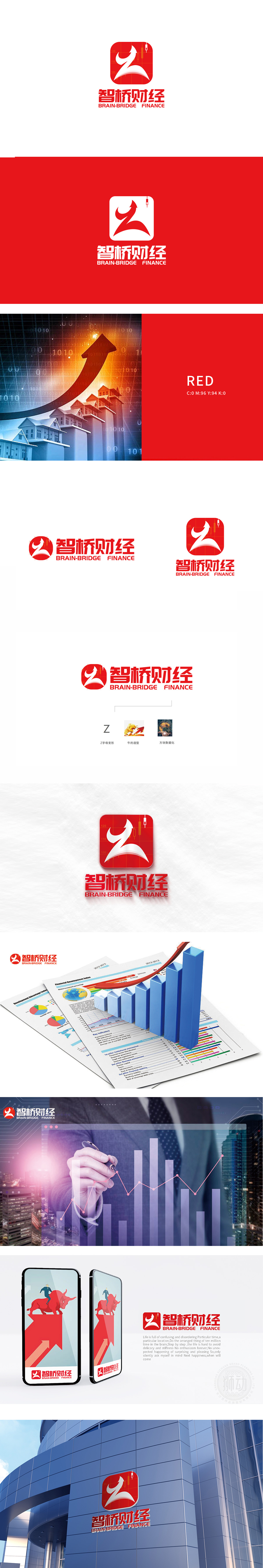
狮动设计通过符号化金融语言的视觉浓缩,“Z”字母变形与“牛”的意象融合,既以流畅曲线勾勒出“Z”的变形,又通过向上扬起的“牛角”轮廓和前倾的动态线条,暗合金融市场“牛市”的积极象征,传递出增长、进取的品牌调性,红色不仅是中国文化中“吉祥、活力”的代表,在金融语境中也常与“上涨、积极”相关联,桥”象征连接(如连接数据与洞察、用户与市场),“智”(Brain)则指向“智慧化分析能力”,二者结合传递出“通过智能技术为财经领域提供桥梁式服务”的品牌定位。用设计赋能金融品牌的“视觉信任力”。
Lion Design not only outlines the deformation of "Z" with a smooth curve, but also coincides with the positive symbol of "bull market" in the financial market through the visual concentration of symbolic financial language and the fusion of "Z" letter deformation and the image of "bull". Red is not only the representative of "auspiciousness and vitality" in China culture. "Bridge" symbolizes connection (such as connecting data and insight, users and markets), while "Brain" points to "intelligent analysis ability". The combination of the two conveys the brand positioning of "providing bridge service for the financial field through intelligent technology".


扫码或拨打添加客服微信


