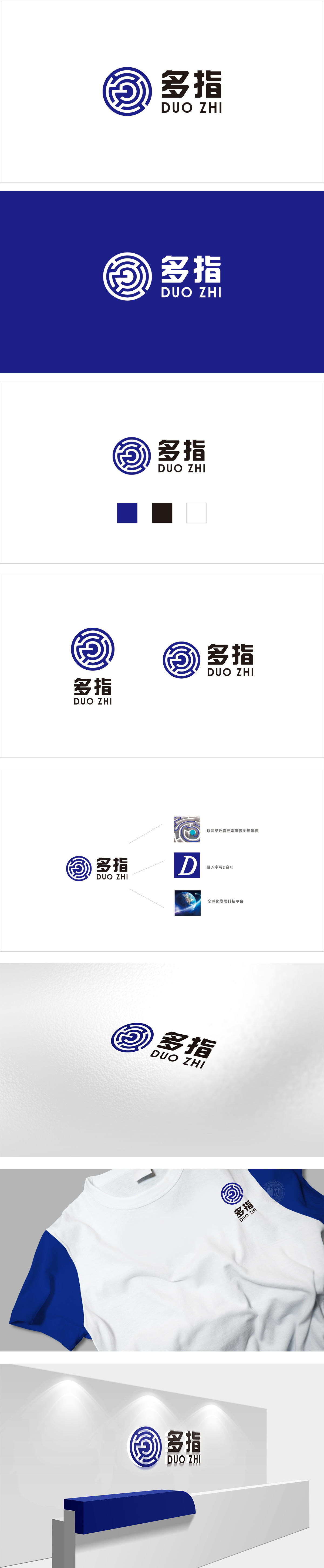
狮动设计通过蓝白相间的环状线条层层嵌套,形成类似“循环”的结构,“G”字母的简化,这种“抽象+具象”的融合,既呼应了“多指”的品牌名称,又通过环状结构传递出“连接、互动、无限延伸”的品牌属性,色彩选取了饱和度适中的“科技蓝”,自带专业、可靠、未来感的属性,整体用最简洁的元素、最贴合的颜色、最合理的布局,把“多指”的品牌名称、行业属性、核心价值都“翻译”成了用户能快速理解的视觉语言。
Lion design adopts blue and white circular lines nested layer by layer, forming a structure similar to "circulation". The simplification of the letter "G" and the fusion of "abstraction and concreteness" not only echo the brand name of "Duozhi", but also convey the brand attributes of "connection, interaction and infinite extension" through the circular structure. The color is "technical blue" with moderate saturation, and it is professional and self-contained.


扫码或拨打添加客服微信


