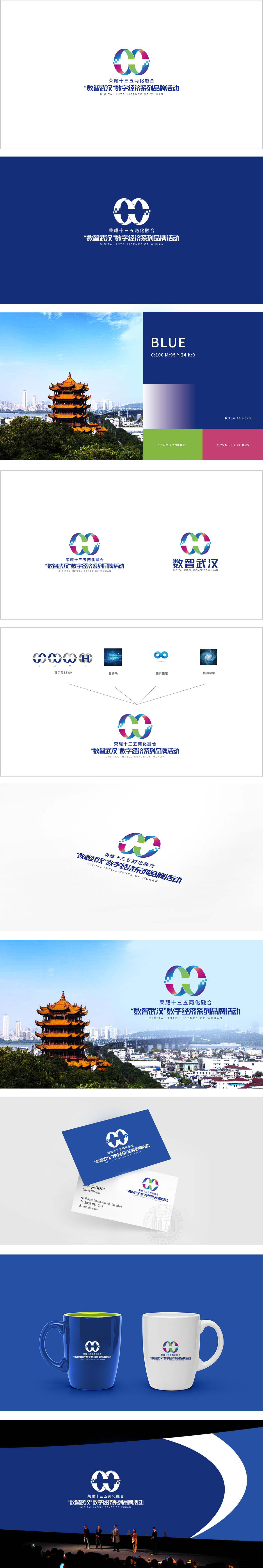
狮动设计采用两个交叉环绕的环形构成,形似数学中的“∞”(无限符号),同时巧妙融入数字“0”的形态。双环交织形成闭环循环,既象征“两化融合”的协同发展,也暗合“数字经济”的无限可能与持续迭代特性,视觉上简洁且具有记忆点。环形边缘采用渐变切割设计,强化“数字化”“智能化”的科技属性,打破传统环形的沉闷感,传递动态与创新的品牌气质。通过“符号化图形+科技细节+多元色彩+清晰排版”**的组合,成功将“两化融合”“数字经济”“武汉特色”三大核心要素浓缩为简洁的视觉符号。渐变色彩的活力传递,共同构建了一个兼具思想性与美感的品牌形象,也展现了武汉在数字经济领域的前瞻布局,设计逻辑清晰,品牌传达高效。
Lion design is composed of two intersecting rings, which looks like "∞" (infinite symbol) in mathematics, and at the same time, it is skillfully integrated into the shape of the number "0". The interweaving of the two rings forms a closed loop, which not only symbolizes the coordinated development of the integration of the two industries, but also coincides with the infinite possibility and continuous iteration characteristics of the digital economy, which is visually concise and has memory points. The edge of the ring is designed by gradual cutting, which strengthens the scientific and technological attributes of "digitalization" and "intelligence", breaks the dull feeling of the traditional ring and conveys the dynamic and innovative brand temperament.


扫码或拨打添加客服微信


