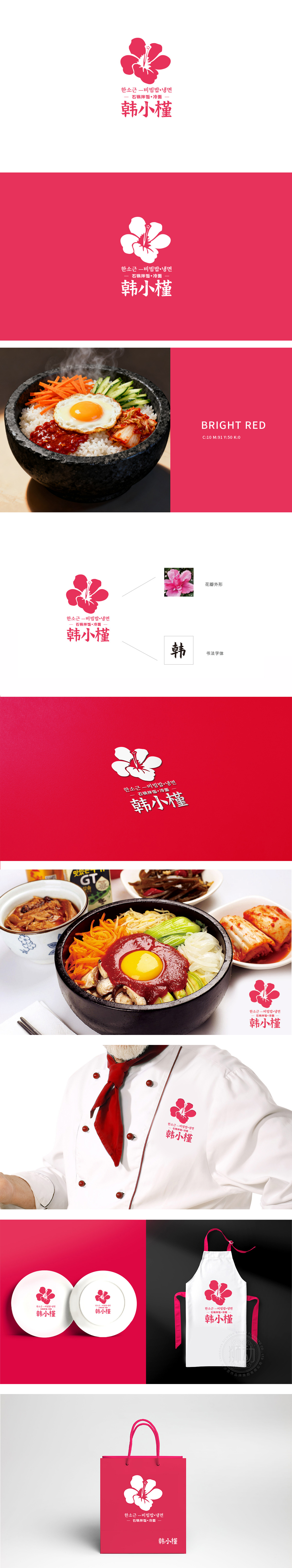
狮动设计通过红色的木槿花,花瓣层次分明,花蕊突出,造型简约大方,具有鲜明的韩式风格。配色以红色为主色调,搭配白色背景,视觉冲击力强,传递出热情、传统的品牌气质。整体以木槿花为视觉符号,主打石锅拌饭和冷面,通过鲜明的色彩与文字,传递出正宗、热情的韩式美食形象。从花蕊到字体,每一寸设计都在喊:“这才是你要的韩式灵魂主食!”
Lion design uses red hibiscus flowers, with distinct petals, prominent stamens, simple and generous shape and distinctive Korean style. With red as the main color and white background, the color matching has strong visual impact and conveys warm and traditional brand temperament. As a whole, hibiscus is the visual symbol, focusing on bibimbap and cold noodles, and conveying authentic and enthusiastic Korean food image through bright colors and words. From stamens to fonts, every inch of design is shouting: "This is the Korean soul staple food you want!"


扫码或拨打添加客服微信


