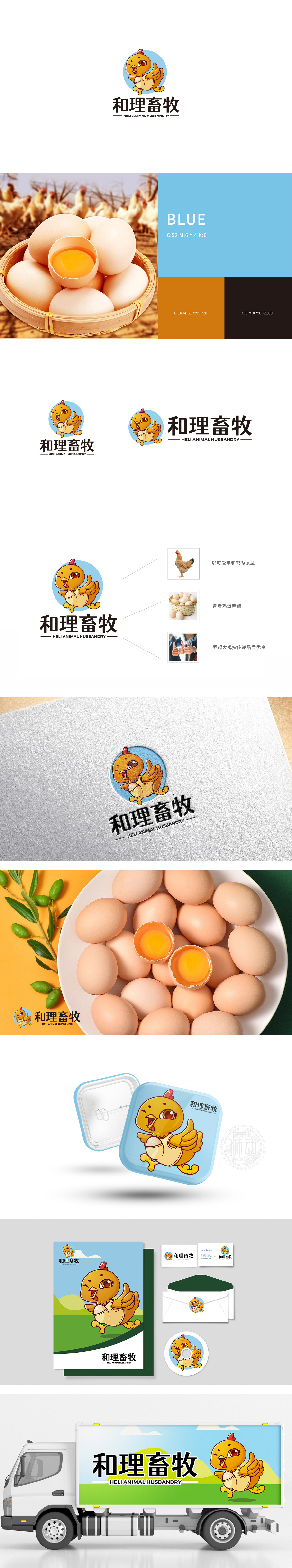
狮动设计以黄色小鸡为核心视觉符号,采用Q版拟人化设计,搭配张开的翅膀和前伸的小爪子,呈现出“奔跑欢呼”的动态感,传递出活泼、健康、充满生命力的品牌气质。小鸡腹部设计为“蛋壳”造型,既呼应“畜牧”行业中“孵化、养殖”的核心场景,又通过“破壳成长”的隐喻,暗示品牌对动物生长过程的用心呵护,赋予图形故事性。整体而言,拟人化小鸡——萌趣形象传递品牌温度,设计既“懂行业”(功能逻辑),又“懂用户”(情感逻辑),为“和理畜牧”构建了友好、专业、值得信赖的品牌视觉资产。
Lion esign takes the yellow chicken as the core visual symbol, adopts the Q version anthropomorphic design, with open wings and outstretched paws, showing the dynamic feeling of "running and cheering" and conveying the brand temperament of liveliness, health and vitality. The chicken belly is designed as an "eggshell" shape, which not only echoes the core scene of "hatching and breeding" in the "animal husbandry" industry, but also implies the brand's care for the animal growth process through the metaphor of "breaking the shell" and endows it with graphic stories. On the whole, the personified chicken-cute and interesting image conveys the brand temperature, and the design not only "understands the industry".


扫码或拨打添加客服微信


