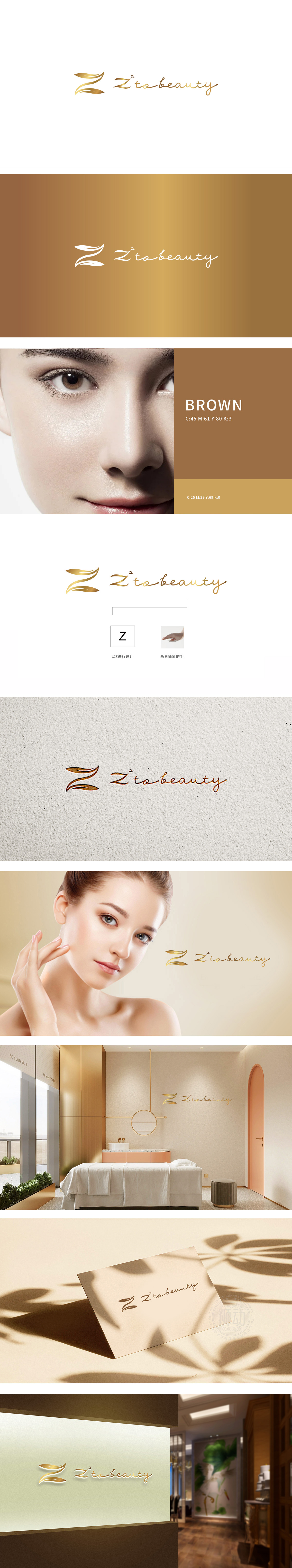
狮动设计以字母“Z”为原型,通过流畅的金色曲线延伸出叶片般的飘逸形态,又通过线条的舒展感,暗合美容行业追求的“自然蜕变”理念——“Z”作为品牌首字母,成为视觉记忆锚点,而叶片/羽翼般的线条则象征“生长、焕新”,手部的抽象化处理避免了具象动作的局限性,转而传递“温柔、专业、呵护”的情感价值,符合美容服务中“手工技艺”与“个性化关怀”的核心体验。通过金属光泽提升了品牌的高端感,暗示服务的品质感与专业性,传递“低调奢华”的品牌人格。LOGO整体结构(图形+“Z to beauty”文字)直接传递“从Z开始,走向美丽”的品牌主张,将抽象的“美容”转化为可感知的“路径感”。
Lion design takes the letter "Z" as the prototype, and extends the elegant shape like a leaf through a smooth golden curve. Through the stretch of lines, it coincides with the concept of "natural transformation" pursued by the beauty industry-"Z" as the brand initials and becomes the anchor point of visual memory, while the lines like leaves/wings symbolize "growth and rejuvenation". The abstract treatment of hands avoids the limitations of figurative movements and instead conveys ". Through metallic luster, the brand's high-end feeling is enhanced, suggesting the quality and professionalism of service, and conveying the brand personality of "low-key luxury".


扫码或拨打添加客服微信


