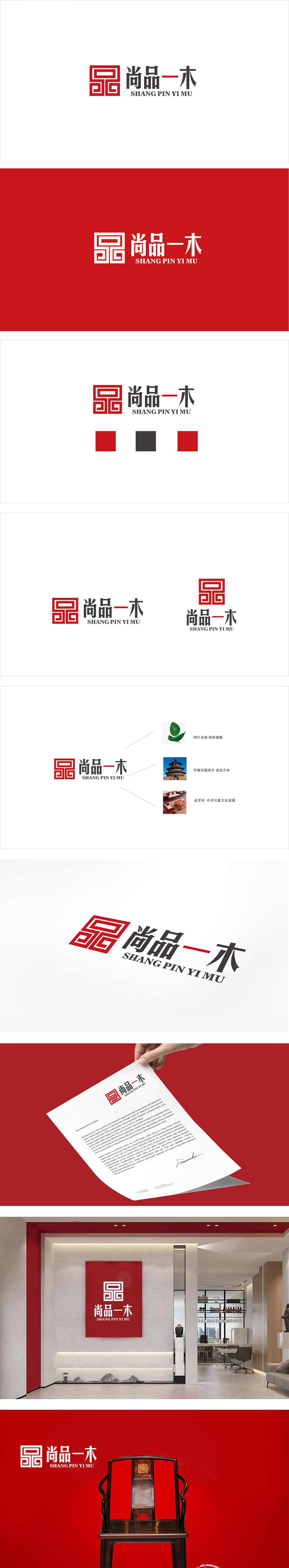
狮动设计采用回纹(中国传统吉祥纹样,象征“循环永恒”“富贵不断”)为基底,重构为抽象的“品”字,回纹的“缠连感”呼应红木家具“榫卯结构”的工艺逻辑;“品”字的具象化,直接点出品牌“重品质、讲品味”的核心定位。 红色作为主色,既符合中国人对“喜庆、尊贵”的文化认知,也通过高饱和度强化了品牌的视觉记忆点。“一”与“木”的笔画衔接,直观传递“一木成器”的概念;整体用传统符号做“意”,现代设计做“形”,形意结合,刚好戳中红木家具消费者“想拥有‘有文化的好家具’”的需求。
Lion design is based on palindromes (traditional auspicious patterns in China, symbolizing "eternal cycle" and "endless wealth"), which are reconstructed into abstract "goods", and the "tangled feeling" of palindromes echoes the technological logic of "tenon and mortise structure" of mahogany furniture. The concretization of the word "product" directly points out the core positioning of the brand "emphasizing quality and stressing taste" Red, as the main color, not only conforms to Chinese's cultural cognition of "celebration and dignity", but also strengthens the brand's visual memory through high saturation. The strokes of "one" and "wood" are connected.


扫码或拨打添加客服微信


