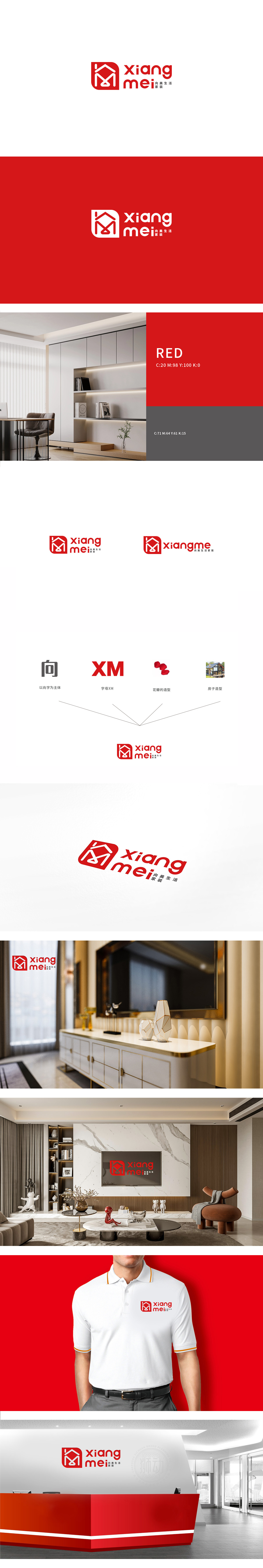
狮动设计以“家”为内核的多维度隐喻,通过极简线条构建了双重意象:“家”的直观呈现:强化“居住空间”的核心联想,直接呼应家装行业的服务场景。“美”与“生活”的抽象表达:“M”形线条首字母缩写,暗合家装设计中“功能与美学统一”的诉求;红色方形边框如同稳固的“围墙”,既界定了品牌视觉边界,也隐喻家装为用户打造“安全、舒适的栖息之所”,符合消费者对“家”的情感需求(庇护、归属)。通过红色温暖感、符号的平衡美,触动消费者对“理想家”的向往,将品牌与“美好生活”深度绑定。
Lion design takes "home" as the core of multi-dimensional metaphor, and constructs a dual image through minimalist lines: the intuitive presentation of "home"; strengthening the core association of "living space" and directly echoing the service scene of home improvement industry. The abstract expression of "beauty" and "life": the acronym of "M" line coincides with the demand of "unity of function and aesthetics" in home decoration design; The red square frame, like a solid "fence", not only defines the visual boundary of the brand.


扫码或拨打添加客服微信


