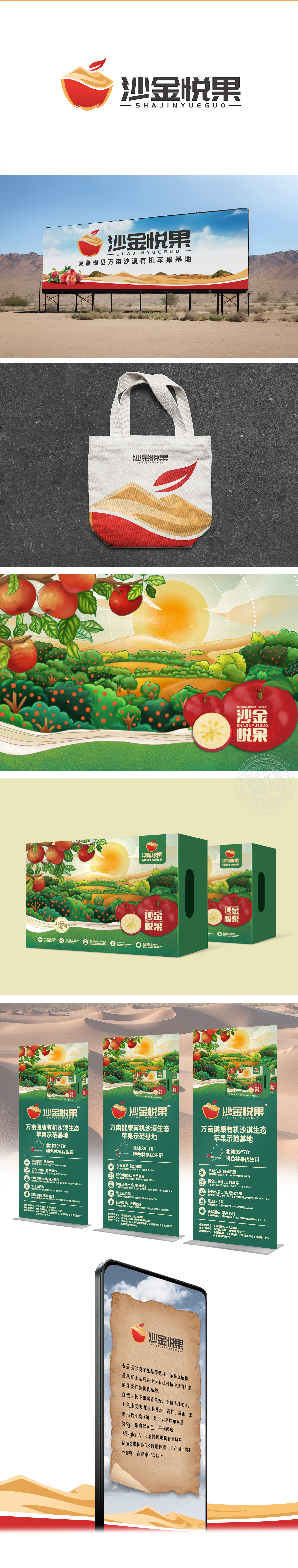
狮动设计以半颗水果剖面为核心,红色主色调直接关联水果的新鲜、成熟与甜美,符合生鲜品类给消费者的直观联想。叶子,既是水果自然属性的象征,又通过上扬的动态线条增强画面的轻盈感与生命力,暗示产品的“新鲜采摘”“天然健康”。“沙金”的命名,又暗示水果的品质如同“金沙”般稀有、优质,提升品牌价值感。通过“水果+叶子”的图形符号、“红黄色系”的色彩搭配、“悦果”的情感化命名,传递品牌三大关键词——新鲜(天然属性)、优质(沙金隐喻)、愉悦(消费体验),精准契合生鲜水果行业的用户需求(安全、美味、健康)。
Lion design takes half a fruit profile as the core, and the main color of red is directly related to the freshness, maturity and sweetness of fruit, which accords with the intuitive association of fresh products to consumers. Leaves not only symbolize the natural attributes of fruits, but also enhance the lightness and vitality of the picture through the rising dynamic lines, implying the "fresh picking" and "natural health" of products. The naming of "gold placer" implies that the quality of fruit is as rare and high-quality as "Jinsha".


扫码或拨打添加客服微信


