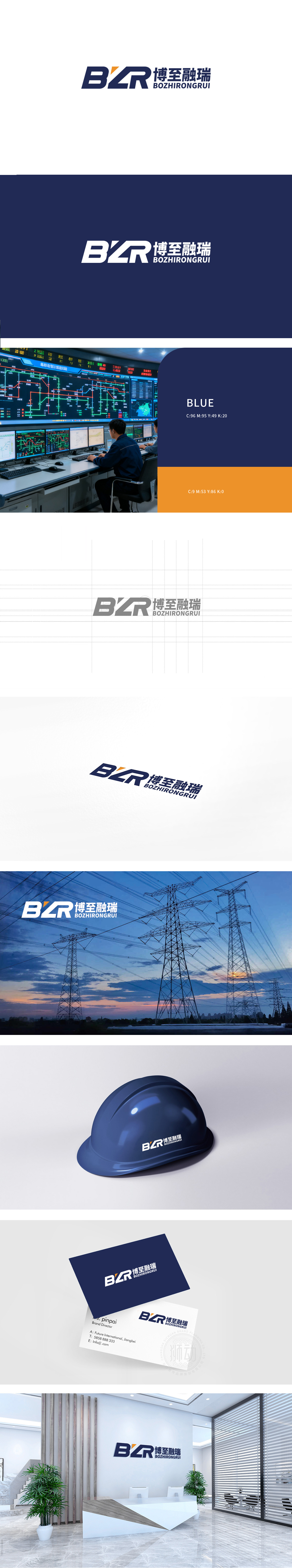
狮动设计以品牌名称首字母“B”“Z”“R”为核心,通过连笔设计形成连贯的整体:传递出协作、连贯的企业特质。字母采用几何化的无衬线体,方中带圆的边角处理,平衡了力量感与亲和力,主体字母以深蓝色为主色调,传递稳重、专业、可靠的形象,符合金融、科技等行业的品牌属性。“博至”寓意“广博、极致”,“融瑞”寓意“融合、祥瑞”,文字本身传递出企业追求多元发展、稳健共赢的愿景。整体传递出一家兼具稳健根基与进取精神的企业形象。
Lion design takes the initials "B", "Z" and "R" of the brand name as the core, and forms a coherent whole through Lian Bi design, which conveys the cooperative and coherent enterprise characteristics. The letters are geometric sans serif, with rounded corners in the square, which balances the sense of strength and affinity. The main letters are dominated by dark blue, conveying a stable, professional and reliable image, which conforms to the brand attributes of finance, technology and other industries. "Bo Zhi" means "extensive and extreme".


扫码或拨打添加客服微信


