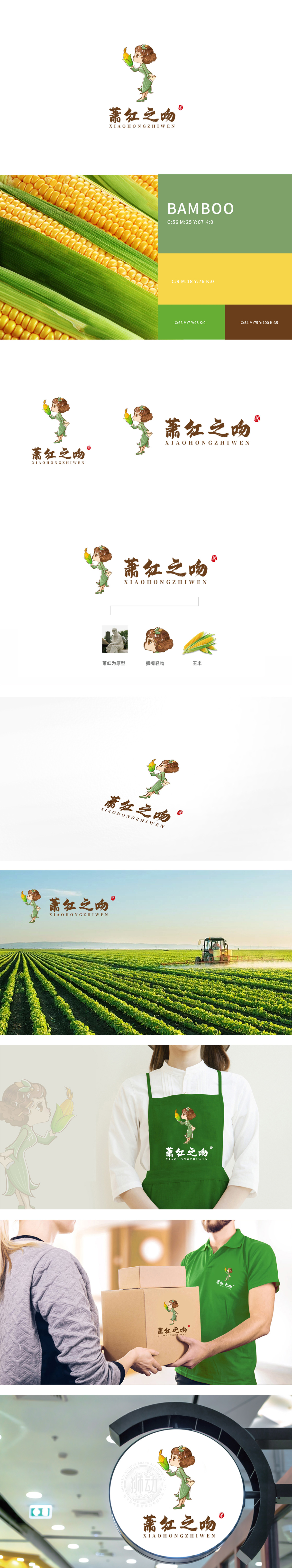
狮动设计以历史人物萧红的典型特征(卷发、民国服饰元素)为基础,通过Q版化处理弱化写实细节,强化“萌系”亲和力,圆润的面部轮廓、微翘的嘴唇(“撅嘴轻吻”动态)赋予角色生动性,既保留了人物辨识度,又降低了历史人物的距离感,更适配现代消费群体的审美偏好。绿色旗袍(呼应自然、农产品属性)与手中的玉米形成强关联,,既点明品牌核心产品,又暗合萧红作品中对东北乡土、自然生命力的文学表达,实现“人物身份-产品属性-文化内涵”的三重绑定,用商业视觉语言讲好了文化故事。
Lion design is based on the typical characteristics of historical figure Xiao Hong (curly hair, clothing elements of the Republic of China). Through Q version processing, realistic details are weakened, and the affinity of "budding" is strengthened. The rounded facial contour and slightly upturned lips (pouting and kissing) give the role vividness, which not only retains the character recognition, but also reduces the sense of distance of historical figures, which is more suitable for the aesthetic preferences of modern consumer groups. The green cheongsam (echoing the nature and agricultural product attributes) has a strong connection with the corn in hand.


扫码或拨打添加客服微信


