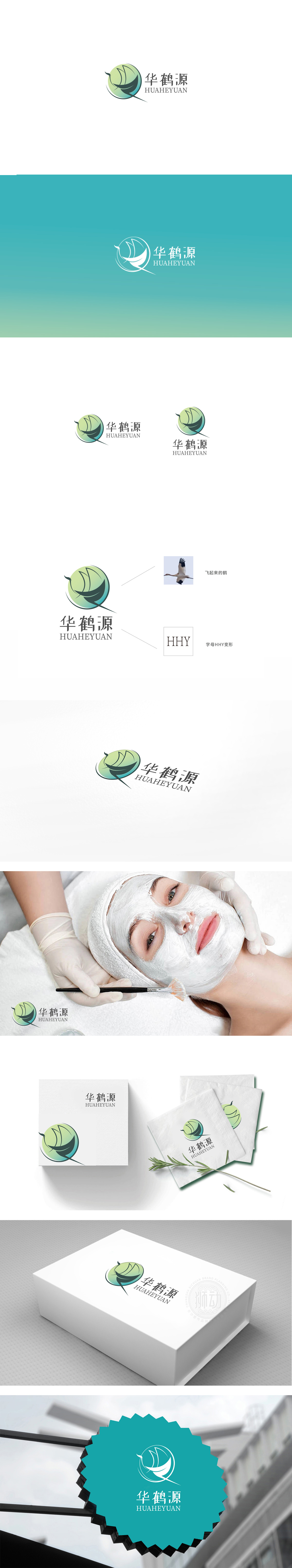
狮动设计采用鹤与叶片的融合,鹤的意象,鹤在传统文化中象征“长寿、吉祥、高洁”,直接关联保健品的“健康、延年益寿”核心价值;羽翼的舒展姿态又传递出轻盈、活力的感觉,暗合“通过调理提升生命状态”的产品理念。羽翼以叶片轮廓呈现,明确指向“天然、草本、植物萃取”的产品属性,绿色渐变圆形既象征“生命、健康、自然”,又营造出包容、和谐的氛围,传递品牌“守护健康、平衡身心”的主张;整体图形传递“中华文化传承、传统养生智慧”的品牌底蕴;又展现出年轻化、活力化的品牌潜力。
Lion design adopts the fusion of cranes and leaves, and the image of cranes symbolizes "longevity, auspiciousness and nobleness" in traditional culture, which is directly related to the core values of "health and longevity" of health care products. The stretching posture of wings conveys the feeling of lightness and vitality, which coincides with the product concept of "improving life state through conditioning". The wings are presented in the outline of leaves, which clearly point to the product attributes of "natural, herbal and plant extraction".


扫码或拨打添加客服微信


