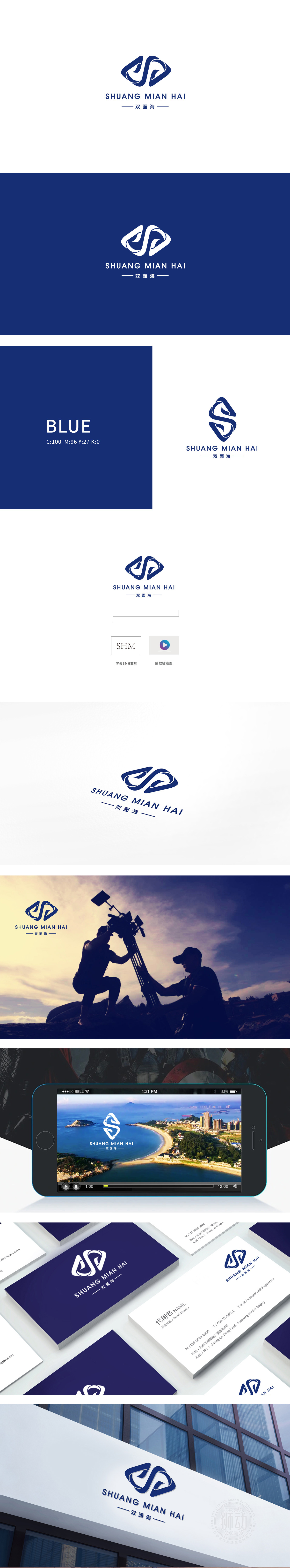
狮动设计采用动态对称的“双螺旋/双环抱”结构:整体呈菱形外轮廓,既像两个相互缠绕的“海浪潮汐”,又似抽象的“双面”符号。曲线的流动感传递出“海”的包容与动态,负空间的巧妙运用,隐喻品牌具备的多元视角或双重价值(如“内容×传播”“创意×技术”等传媒属性)。深蓝色沉稳、专业,既符合“海”的自然联想,也传递出传媒行业所需的可靠与深度,同时蓝色的包容性也暗示品牌的广阔视野。Logo通过“流动的双面”传递出**“多维度观察”“双向沟通”**的行业特质——传媒的核心在于连接信息与受众,“双面”象征对内容的深度挖掘与多元解读,而“海”则暗示信息的广度与传播的无界性,设计与品牌定位的契合度很高。
Lion design adopts a dynamically symmetrical "double helix/double embracing" structure: the whole body is in a rhombic outline, which is like two intertwined "waves and tides" and an abstract "double-sided" symbol. The fluidity of the curve conveys the tolerance and dynamics of the "sea", the clever use of negative space, and the multiple perspectives or dual values of the brand (such as media attributes such as "content × communication" and "creativity× technology"). Dark blue is calm and professional, which not only conforms to the natural association of "sea", but also conveys the reliability and depth needed by the media industry.


扫码或拨打添加客服微信


