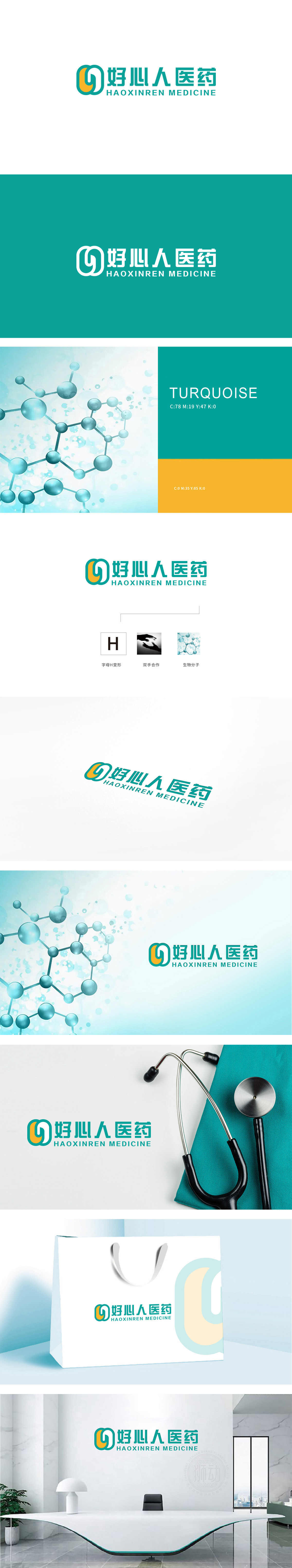
狮动设计采用两个半环嵌套构成,白色半环与橙色填充的区域巧妙构成倾斜的“十字”轮廓,传递“柔性关怀”,符合医药品牌“守护健康”的核心使命。橙色部分可解读为抽象的“人”的侧身剪影,头部微微上扬,与外层绿色环形形成“被环绕守护”的视觉关系,直观传递“以患者为中心”的品牌立场,强化“好心人”的情感连接。绿色是医药、健康领域的标杆色,传递“安全、专业、自然”的认知,整体以“守护”为核心,构建医药行业专属视觉语言,刚柔并济,强化“专业+亲和”的品牌气质。
Lion design is composed of two semi-rings, and the white semi-ring and the orange filled area skillfully form an inclined "cross" outline, which conveys "flexible care" and conforms to the core mission of medical brands to "protect health". The orange part can be interpreted as an abstract silhouette of "people", with the head slightly raised, forming a visual relationship with the outer green ring, intuitively conveying the brand position of "patient-centered" and strengthening the emotional connection of "good people". Green is the benchmark color in the field of medicine and health, which conveys the cognition of "safety.


扫码或拨打添加客服微信


