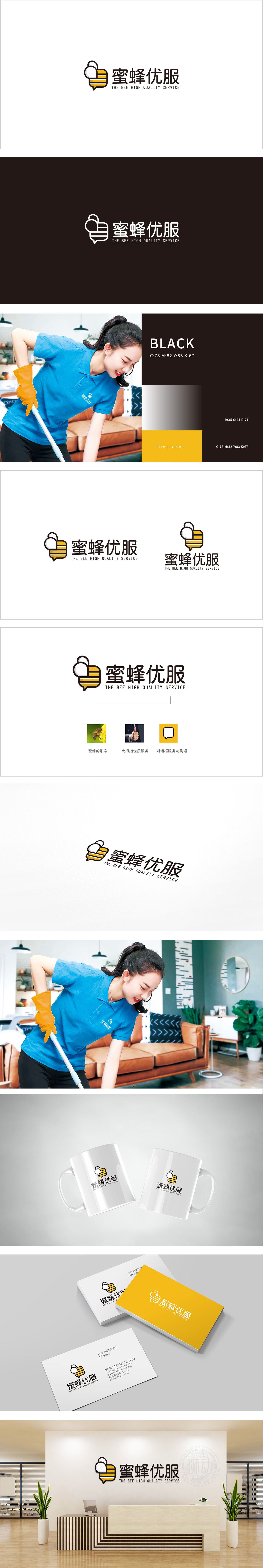
狮动设计采用蜜蜂为主元素,蜜蜂是勤劳、细致、高效的代名词,与家政服务中“清洁、整理、贴心”的核心需求高度契合。 传递“专业、可靠”的品牌联想,降低用户认知成本。“蜜蜂优服”通过生物符号传递“精致服务”而非“体力劳动”,更贴近中高端用户对“品质生活”的追求,用一个核心符号(蜜蜂)串联起“属性(勤劳)—动作(服务对话)—价值(优质)”,每个设计细节都服务于品牌定位,简洁却不简单。
Lion design uses bees as the main element. Bees are synonymous with diligence, meticulous and high efficiency, which is highly compatible with the core needs of "cleanliness, neatness and intimacy" in domestic service. Deliver "professional and reliable" brand association and reduce the cognitive cost of users. "Bee Youfu" conveys "exquisite service" rather than "manual labor" through biological symbols, which is closer to the pursuit of "quality life" by middle and high-end users. A core symbol (bee) is used to connect "attribute (diligence)-action (service dialogue)-value (quality)", and every design detail serves the brand positioning, which is simple but not simple.


扫码或拨打添加客服微信


