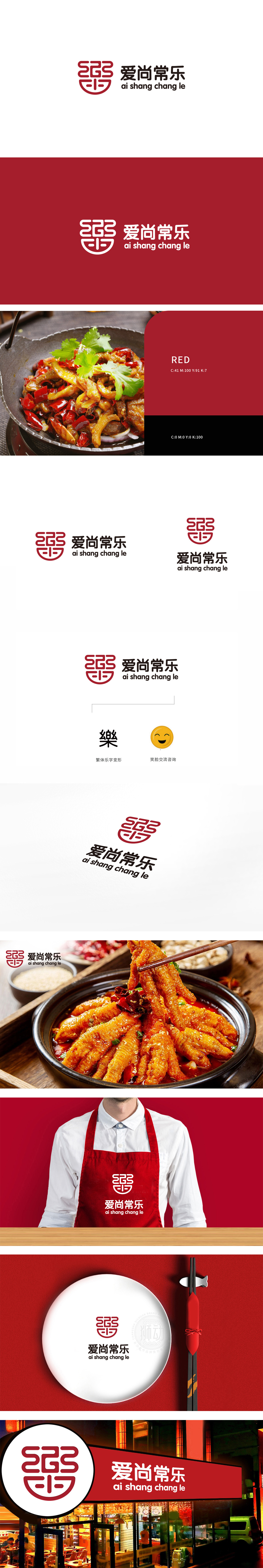
狮动设计以“乐”为魂,用“食”为形,传统印章式结构增强信任感,红色印章式设计,传递“地道、可靠、有底蕴”的品牌气质,内部通过线条的对称与穿插,巧妙融合了“乐”字的意象(舒展的线条如笑容般传递愉悦感)与“食”的形态(暗合餐饮属性),整体既呼应“常乐”的品牌名,又暗含“美食带来喜乐”的消费联想。经典中国红+沉稳黑,强化视觉记忆与文化属性,承载了“喜庆、热闹、团圆”的情感内涵,贴合餐饮场景中“欢聚、愉悦”的核心需求,真正做到了“图形即品牌,符号即故事”。
Lion design takes "music" as its soul and "food" as its shape, and the traditional seal structure enhances trust.The red seal design conveys the brand temperament of "authentic, reliable and profound". Through the symmetry and interpenetration of lines, the image of the word "Le" (stretching lines convey pleasure like a smile) and the form of "Food" (which coincides with the attributes of catering) are ingeniously integrated.which not only echoes the brand name of "Changle" but also implies the consumption association of "Food brings joy".


扫码或拨打添加客服微信


