首页 >> 原创案例
  • 行业分类
    全部 日化/日用 鞋服配饰 食品/烟酒茶/商超 餐饮/酒店 农渔牧业 医疗服务 保健/养生 家政/安保/维修 家电/商用电器 家居/软装 地产/建材 金融/管理/HR 互联网 广告/印刷/媒体 中介/代理服务 教育/培训 娱乐/文化 珠宝/工艺礼品 旅游服务 化工/能源/环保 重工机械/科技 车辆/运输/汽配 活动/公益/政府 综合型企业
  • 设计分类
    全部 LOGO设计 吉祥物/卡通 包装设计 UI/WEB设计 宣传品 展厅/文化墙 室内设计 VIS/SI/全案
  • 宁橙 生鲜农产品 LOGO设计

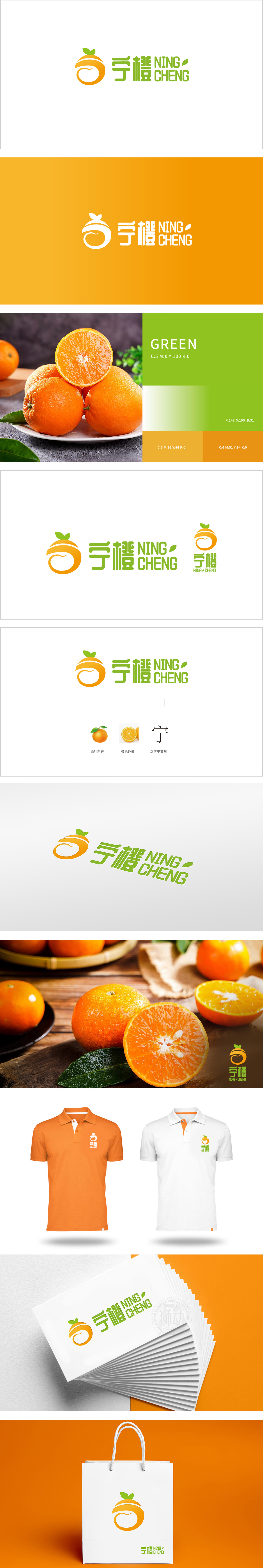
    狮动设计以抽象化的“橙子”为核心视觉符号,橙色渐变的圆形轮廓清晰点明水果品类,橙色(果实成熟、温暖)+ 绿色(新鲜、健康)的经典自然配色,不仅符合生鲜水果的行业属性,还能激发消费者对“天然、优质”产品的联想,视觉上简洁、生动,清爽又富有生机,符合生鲜行业的清新调性。

    Lion design takes the abstract "orange" as the core visual symbol, the circular outline with gradual orange color clearly points out the aquatic fruits, and the classic natural color matching of orange (ripe and warm fruits)+green (fresh and healthy) not only conforms to the industrial attributes of fresh fruits, but also stimulates consumers' association with "natural and high-quality" products.


    宁橙 生鲜农产品 LOGO设计


    我想要类似的服务>>

    发表评论(179+)>>


    测试221124测试221124

    T:189 0730 1477

    www.shidong.co

    2016-2022 狮动®长沙思传品牌策划有限公司

    湘ICP备2022023572号-1

    咨询客服

    189 0730 1477

    扫码或拨打添加客服微信

    预约设计

    咨询客服 & 预约设计

    189 0730 1477

    扫码或拨打添加客服微信