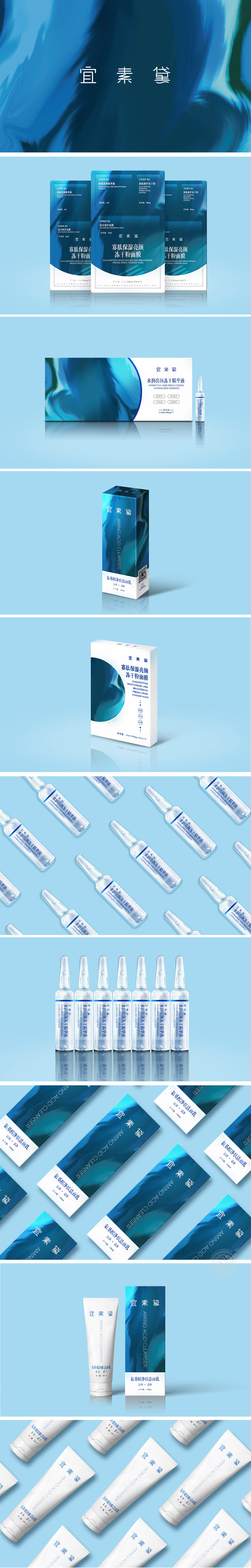
狮动设计以深海蓝为主色调,搭配渐变光影效果,既呼应“保湿”“冻干粉”的产品属性,又通过深浅层次营造高级感;蓝色系的稳重感与流动纹理的灵动性平衡,既体现了护肤品的专业性,又传递出温和、高效的产品气质,背景融入流动的水波纹或光带肌理,抽象化表现“保湿”“滋养”的肤感体验,线条细腻且富有动态,增强包装的质感与记忆点。整体通过流程可视化(三步分阶)、视觉符号化(蓝调+水纹)、信息结构化(核心卖点突出),成功将“科技成分”“分步护理”“保湿修护”三大核心价值转化为直观的视觉语言。
Lion design is based on deep sea blue, with gradual light and shadow effects, which not only echoes the product attributes of "moisturizing" and "freeze-dried powder", but also creates a sense of high quality through shades; The balance between the sedateness of blue color and the agility of flowing texture not only reflects the professionalism of skin care products, but also conveys the gentle and efficient product temperament. The background is blended with flowing water ripples or light texture, which abstractly expresses the skin feeling experience of "moisturizing" and "nourishing", and the lines are delicate and dynamic.


扫码或拨打添加客服微信


