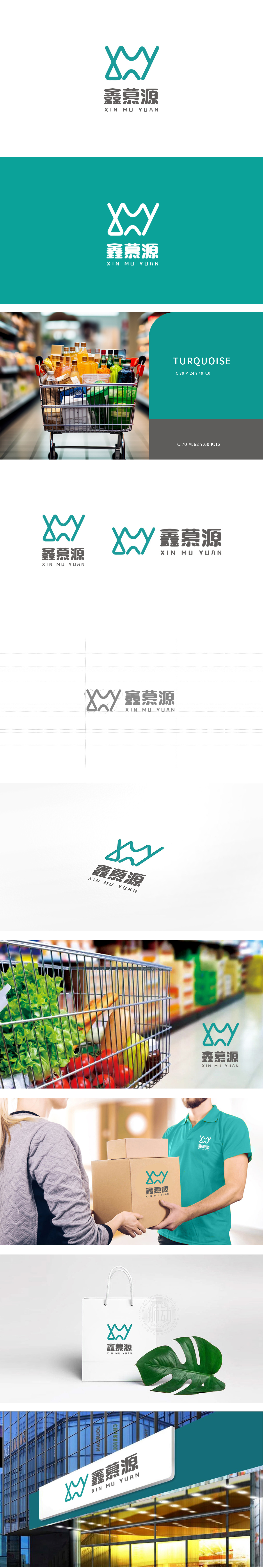
狮动设计由流畅的绿色曲线构成,整体呈现出类似“W”“M”“Y”的字母形态,叶片/藤蔓的生长感:曲线的起伏转折类似植物叶片的舒展或藤蔓的缠绕,传递出生鲜产品“自然生长、新鲜活力”的属性;水流/纽带的意象:线条的流动性也可联想为“水源”或“连接”(从产地到餐桌的供应链),强化了生鲜行业对“新鲜、流通”的核心需求。整体通过图形符号的意象化(生长、流动)、色彩的经典联想(绿色=生鲜)、字体的气质传递(专业+自然),构建了一套完整的视觉语言,精准匹配了生鲜行业对“新鲜、天然、专业、可靠”的核心诉求。
Lion design is composed of a smooth green curve, showing a letter shape similar to "W", "M" and "Y" as a whole, and the growth sense of leaves/vines: the ups and downs of the curve are similar to the stretching of plant leaves or the winding of vines, conveying the attributes of "natural growth and fresh vitality" of fresh products;Image of water flow/bond: The fluidity of lines can also be associated with "water source" or "connection" (supply chain from the place of origin to the table), which strengthens the core demand of fresh food industry for "freshness and circulation".


扫码或拨打添加客服微信


