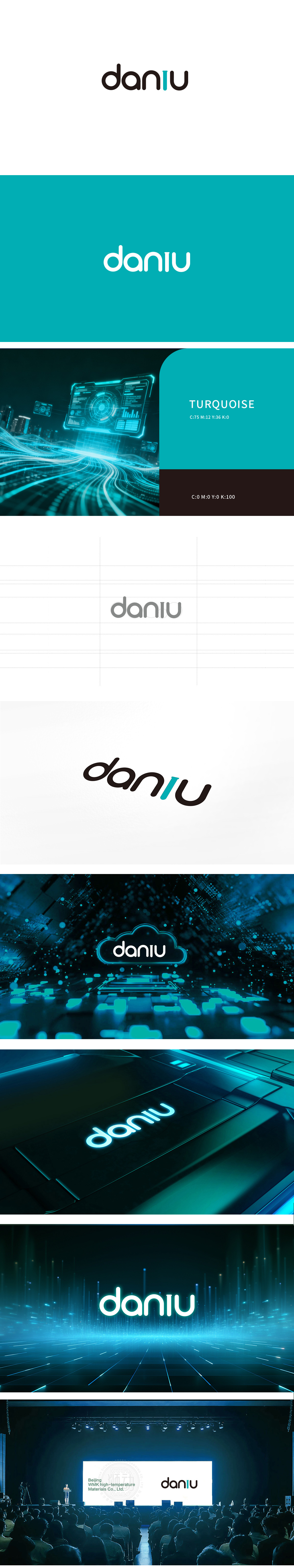
狮动设计采用无衬线黑体作为基础,字形圆润饱满,传递出亲和、现代的气质,“i”的设计是点睛之笔——用高饱和的蓝绿色竖线替代传统圆点,不仅打破了全黑字体的沉闷,还通过色彩对比形成视觉焦点,整体设计偏向“轻量级”,符合科技、互联网、产品对“高效、直接”的视觉需求。
Lion design is based on sans-serif bold, and its glyph is round and full, conveying affinity and modern temperament. The design of "I" is the finishing touch-replacing traditional dots with highly saturated blue-green vertical lines, which not only breaks the dullness of all-black fonts, but also forms a visual focus through color contrast, and the overall design tends to be "lightweight", which meets the visual requirements of technology, Internet and products for "efficiency and directness".


扫码或拨打添加客服微信


