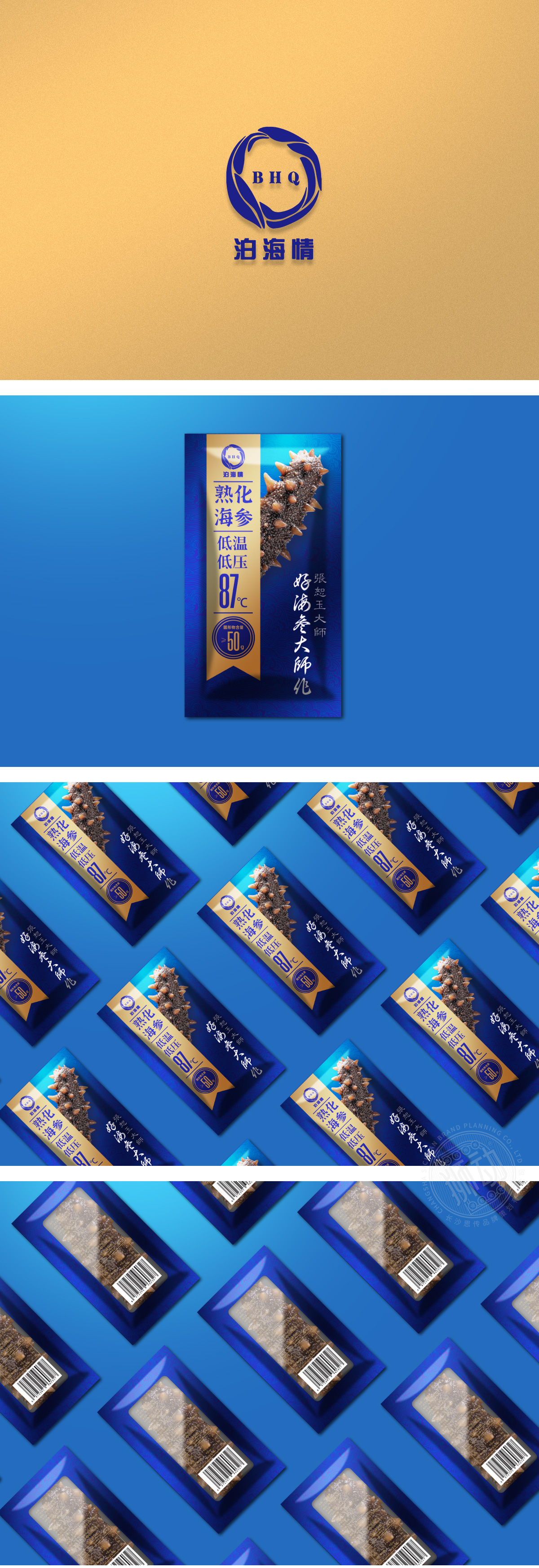
狮动设计选用渐变深蓝与暗纹海水纹理,既呼应“海参”的海洋属性,又通过低饱和度营造沉稳、高端的质感,符合滋补品的品类定位。金色条带与点缀:中间垂直贯穿的金色条带形成视觉焦点,分割画面的同时,通过冷暖色对比突出核心信息,金色本身也象征品质感与价值感,强化“高端”认知。通过高清摄影直接展示产品形态,以“真实感”建立消费者信任,解决海参产品“看不见实物”的痛点。通过 “深海蓝+鎏金”的高端配色、实拍产品与工艺参数的可视化、传统符号与现代信息层级的结合,成功实现了“高端滋补品”的定位传达,整体达到了“商业信息传递”与“美学价值”的平衡。
Lion design uses gradient dark blue and dark sea texture, which not only echoes the marine attributes of "sea cucumber", but also creates a calm and high-end texture through low saturation, which conforms to the category positioning of tonics.Gold stripes and embellishments: The vertical gold stripes in the middle form the visual focus, and at the same time, it highlights the core information through the contrast of cold and warm colors. Gold itself also symbolizes the sense of quality and value, and strengthens the "high-end" cognition. Through high-definition photography.


扫码或拨打添加客服微信


