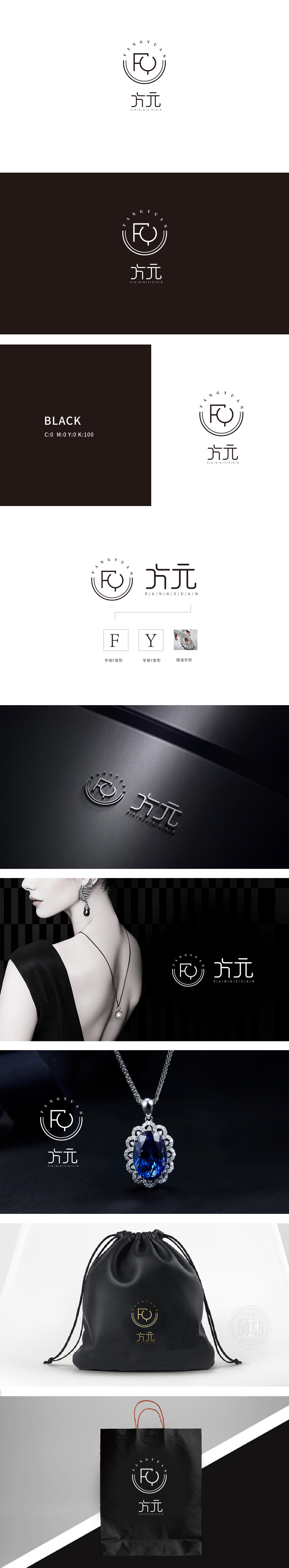
狮动设计以品牌名称首字母“F”(方)和“Q”的变体,通过直线与弧线的穿插组合,形成“方中带圆”的视觉符号。既像珠宝镶嵌中的“包镶”工艺,又似放大镜下的宝石切面,强化“聚焦精致细节”的品牌联想。直线象征珠宝设计中的“切割棱角”,弧线则呼应“圆润宝石”,暗合珠宝品类中“刚柔并济”的材质特性。外环双圆轮廓:圈层感与高级感的营造,传递出珠宝品牌常见的“高贵、完整、永恒”的视觉语言。LOGO将东方意境与珠宝的“文化属性”结合,实现极简主义与珠宝的“高级质感”适配。
Lion Design uses the variants of the initials "F" (square) and "Q" of the brand name to form a visual symbol of "circle in the square" through the combination of straight lines and arcs. It is not only like the "inlaying" process in jewelry inlaying, but also like the gem section under a magnifying glass, which strengthens the brand association of "focusing on exquisite details". The straight line symbolizes the "cutting edges and corners" in jewelry design, while the arc line echoes the "rounded gem", which coincides with the material characteristics of "combining rigidity with softness" in jewelry category. Double-circle outline of the outer ring: the creation of a sense of circle and advanced sense conveys the common visual language of "noble.


扫码或拨打添加客服微信


