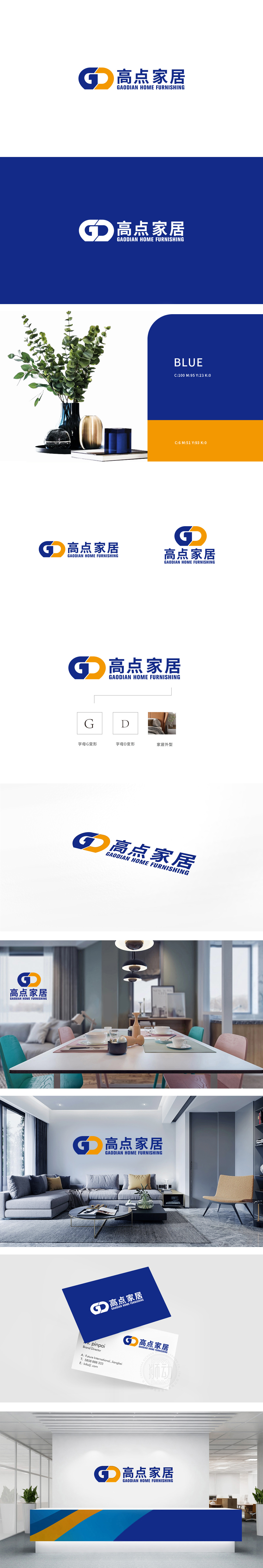
狮动设计将蓝色字母“G”与橙色字母“D”变形而成,巧妙呼应“高点”的首字母缩写。蓝色半环线条流畅,形成类似“环抱”的形态,既保留字母“G”的识别度,又暗喻家居产品带来的“空间感”与“安全感”;“D”的结构感:以直角转折收尾,融入家居产品的“结构线条”,体现行业。整体以“极简字母变形”为核心,通过色彩、线条、图形的有机组合,既实现了品牌名称的符号化表达,又深度绑定家居行业的“空间感”“温暖感”“结构感”。
Lion design is formed by transforming the blue letter "G" and the orange letter "D", which skillfully echoes the acronym of "High Point". The blue semi-ring line is smooth, forming a shape similar to "embracing", which not only retains the recognition of the letter "G", but also implies the "sense of space" and "security" brought by household products; Structural sense of "D": ending with a right-angle turn, blending into the "structural lines" of household products, reflecting the industry.


扫码或拨打添加客服微信


