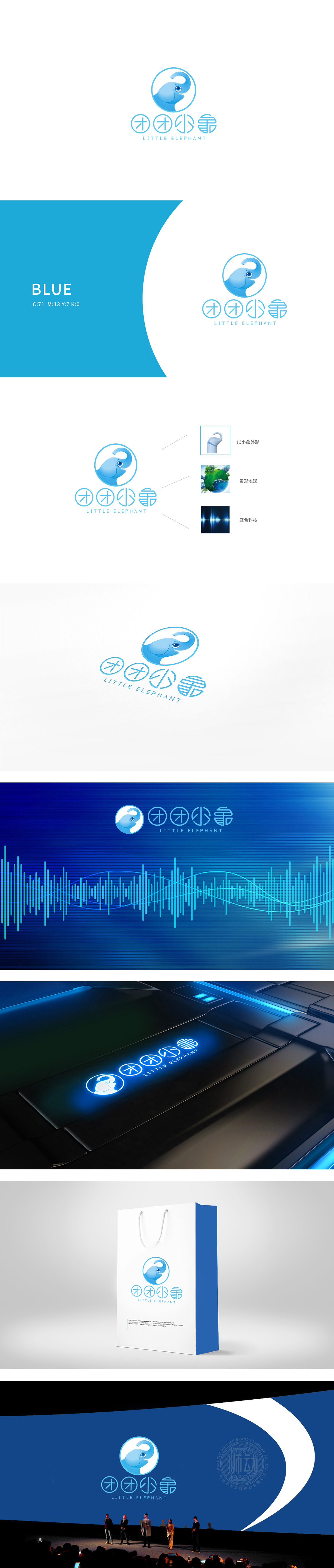
狮动设计以小象头部轮廓为核心,用圆润线条勾勒出可爱的面部特征,保留了动物形象的亲切感,符合科技产品“友好交互”的定位。象鼻的弧度与圆形轮廓形成视觉闭环,暗含“连接全球”“智慧覆盖”的科技愿景,采用纯净的浅蓝色调贯穿整体,既符合“蓝色科技”的行业视觉符号,又通过色彩明度和饱和度的控制,传递出轻盈、可靠的气质。通过主LOGO的“圆形轮廓”作为视觉枢纽,将具象动物、抽象科技、宏观愿景串联起来,形成“可爱形象→科技属性→品牌格局”的认知递进,这种“以小见大”的图形叙事能力,正是图形分析科技在品牌设计中的典型应用——用视觉元素的逻辑关系传递品牌深层价值。
Lion design takes the outline of the elephant's head as the core, and outlines the lovely facial features with rounded lines, which retains the intimacy of animal images and conforms to the positioning of "friendly interaction" of scientific and technological products. The radian of the trunk and the circular outline form a visual closed loop, implying the scientific and technological vision of "connecting the whole world" and "covering with wisdom". The pure light blue tone runs through the whole, which not only conforms to the industrial visual symbol of "blue technology", but also conveys a light and reliable temperament through the control of color lightness and saturation.


扫码或拨打添加客服微信


