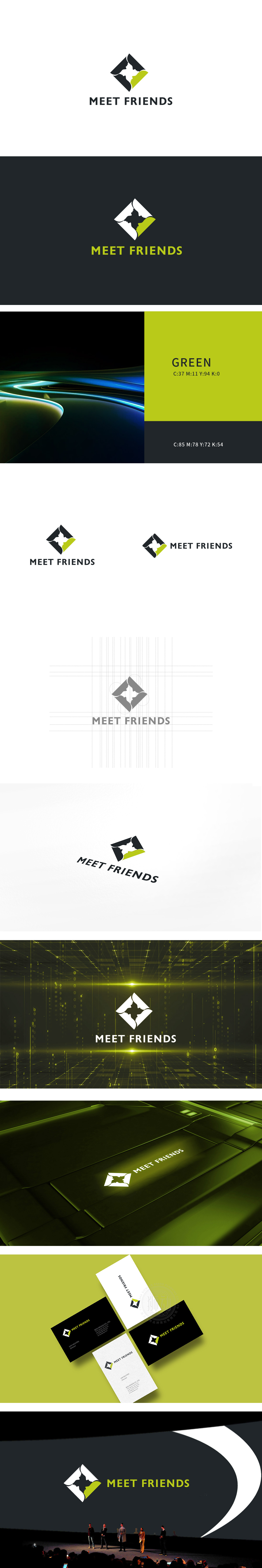
狮动设计用菱形框架构建稳定感,内部通过正负形巧妙融合了两个人的侧脸轮廓——左侧黑色剪影与右侧白色、绿色的头像形成对比,既像面对面交流的姿态,又暗含“相遇”“连接”的社交属性,绿色的点缀还增添了活力与亲和力。图形与文字的搭配简洁直观,科技感与人文关怀兼顾。
Lion design uses a diamond-shaped frame to build a sense of stability. Inside, the silhouette of two people's side faces is ingeniously blended through the positive and negative shapes-the black silhouette on the left side contrasts with the white and green head portrait on the right side, which is not only like the gesture of face-to-face communication, but also implies the social attributes of "meeting" and "connecting". The embellishment of green also adds vitality and affinity.


扫码或拨打添加客服微信


