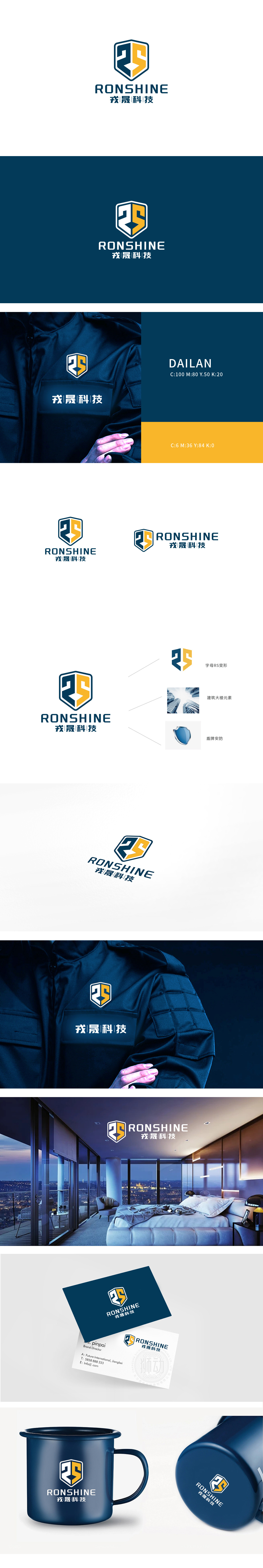
狮动设计采用正六边形盾牌造型,这是安全、防护、可靠的全球通用视觉语言,关联“保安”服务的核心功能(安全保障),给人稳固、值得信赖的第一印象,盾牌内部的蓝黄双色区域,巧妙构成了汉字“戎”的抽象变形(“戎”本义为兵器、军事,引申为“守卫”):晟”(shèng)本义为“光明、兴盛”,象征品牌“蒸蒸日上”的发展愿景,也暗合家政保安服务为家庭带来“安全与光明”的价值——守护不仅是防御,更是创造安心的生活环境。整体通过盾牌、色彩、字体的组合,在“安全严肃性”与“服务亲和力”之间找到了精准平衡,堪称“功能与情感双驱动”的典范。
Lion design adopts a hexagonal shield shape, which is a safe, protective and reliable global visual language. It is related to the core function of "security" service (safety guarantee), giving people a solid and trustworthy first impression. The blue and yellow double-color area inside the shield skillfully constitutes the abstract deformation of the Chinese character "Rong" (the original meaning of "Rong" is weapons and military, and it is extended to "guard"): Symbolizing the brand's development vision of "thriving", it also coincides with the value that domestic security service brings "safety and light" to the family-guarding is not only a defense.


扫码或拨打添加客服微信


