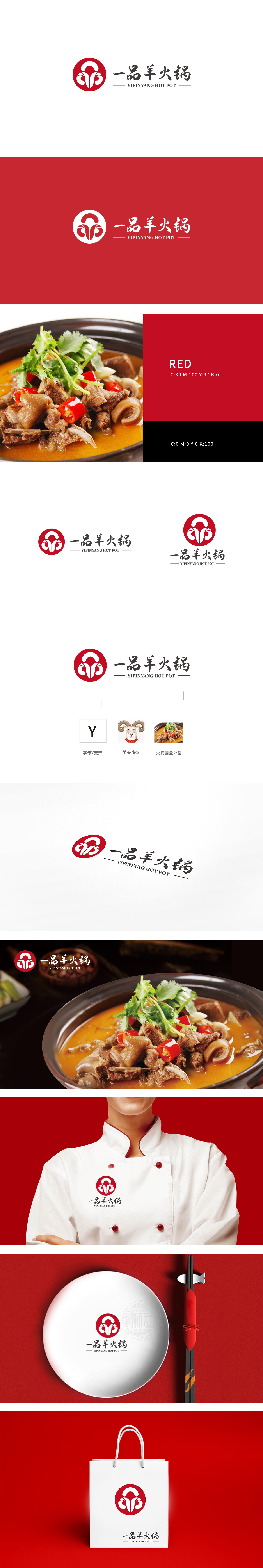
狮动设计以圆形红色背景主元素,融入行业关联:羊角意象直接呼应“羊火锅”的核心食材,视觉上易引发“羊肉”“新鲜”的联想,强化品类认知。对称线条借鉴传统纹样(如祥云、回纹),传递出“吉祥”“正宗”的中式餐饮调性,暗合“一品”所蕴含的“高品质”“老字号”定位。圆形外框象征圆满、团圆,适合火锅“聚餐”“共享”的场景属性,采用毛笔书法字体,笔触流畅。带有手写感,传递出传统工艺“匠心制作”的品牌理念,与“一品”的“高端”“地道”定位契合;整体设计融合传统与现代元素——传统纹样、书法字体传递“正宗口味”。
Lion design has a round red background as the main element, which is integrated into the industry association: the image of goat's horn directly echoes the core ingredients of "mutton hot pot", which is easy to visually trigger the association of "mutton" and "freshness" and strengthen the category cognition. Symmetrical lines draw lessons from traditional patterns (such as auspicious clouds and palindromes), convey the "auspicious" and "authentic" Chinese catering tonality, and coincide with the positioning of "high quality" and "old brand" contained in "Yipin".


扫码或拨打添加客服微信


