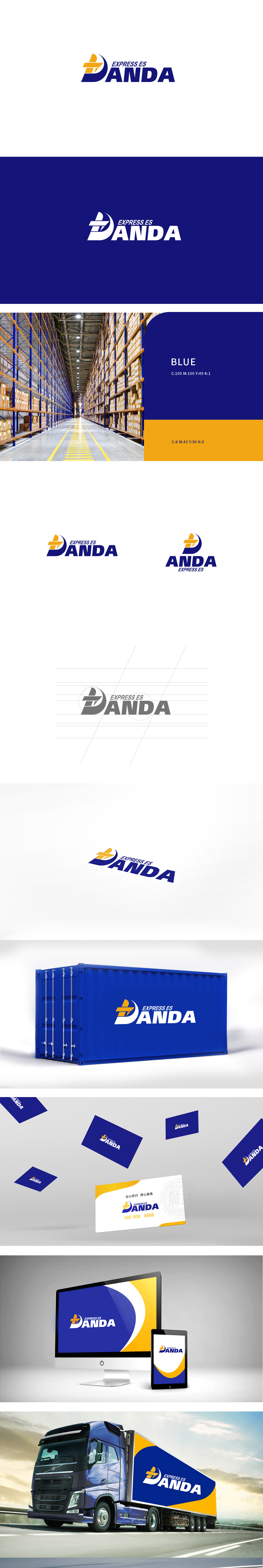
狮动设采用三个交错的箭头组成,直接传递“运输、流动、多向配送”的物流核心功能。箭头的锐角设计和叠加层次,既体现动态感,又隐喻“高效、快速”的服务特点,深蓝色半弧形,如同包裹、盾牌或轨迹线,既形成视觉包围感(象征“安全送达”),又通过曲线柔化箭头的锐利,平衡“速度”与“可靠”的双重品牌诉求。蓝色主色调:深蓝色常用于物流、科技行业,传递“专业、稳重、可信赖”的品牌形象,通过视觉元素直接传递“速度、安全、专业、可信赖”的服务价值。
Lion consists of three staggered arrows, which directly convey the core logistics functions of "transportation, flow and multi-directional distribution". The acute angle design and overlapping level of the arrow not only reflect the dynamic sense, but also symbolize the service characteristics of "high efficiency and quickness". The dark blue semi-arc, like a package, shield or track line, not only forms a sense of visual encirclement (symbolizing "safe delivery"), but also softens the sharpness of the arrow through the curve, balancing the dual brand demands of "speed" and "reliability".


扫码或拨打添加客服微信


