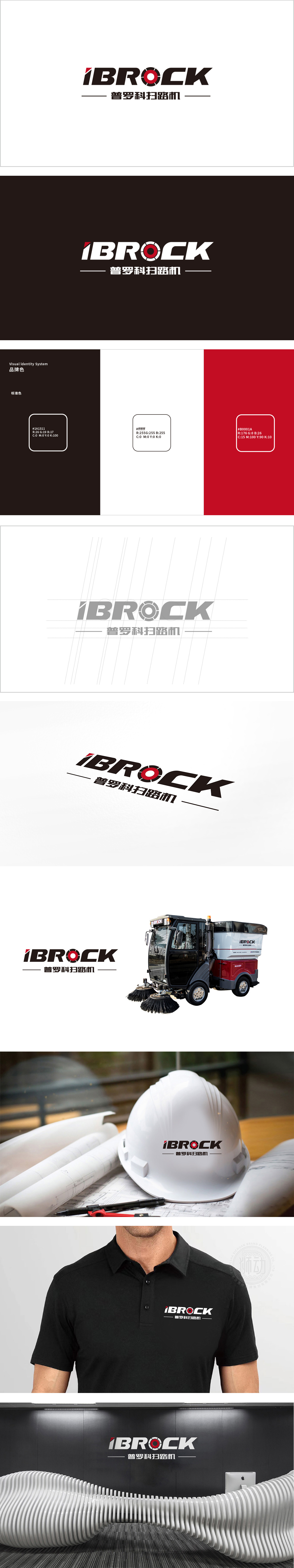
狮动设计将“BROCK”的“O”设计为红色同心圆+黑色齿轮齿状外框的组合:红色内圆:既是视觉焦点,也可隐喻扫路机的核心部件,红色传递活力与高效,符合工程设备“可靠、醒目”的属性;黑色齿轮外框:齿轮是机械工业的经典符号,直接关联“重工设备”的行业属性,同时齿轮的环形结构与“O”字母的形态自然融合,实现“字母即图形”的双重功能。整体采用粗体无衬线字体,线条硬朗、边缘平直,体现工业设备的“坚固、稳重”,符合重型机械的品牌气质;将行业属性、产品功能与视觉符号高度浓缩,—用符号讲透品牌故事。
Lion designs the "O" of "BROCK" as a combination of red concentric circles and black toothed outer frame: the red inner circle is not only a visual focus, but also a metaphor for the core component of the road sweeper, and red conveys vitality and efficiency, which conforms to the attributes of "reliable and eye-catching" of engineering equipment; Black gear frame: Gear is a classic symbol in the mechanical industry, which is directly related to the industrial attributes of "heavy industry equipment". At the same time, the ring structure of gear naturally blends with the form of "O" letter, realizing the dual function of "letter is graphics". As a whole, bold sans serif fonts are used.


扫码或拨打添加客服微信


