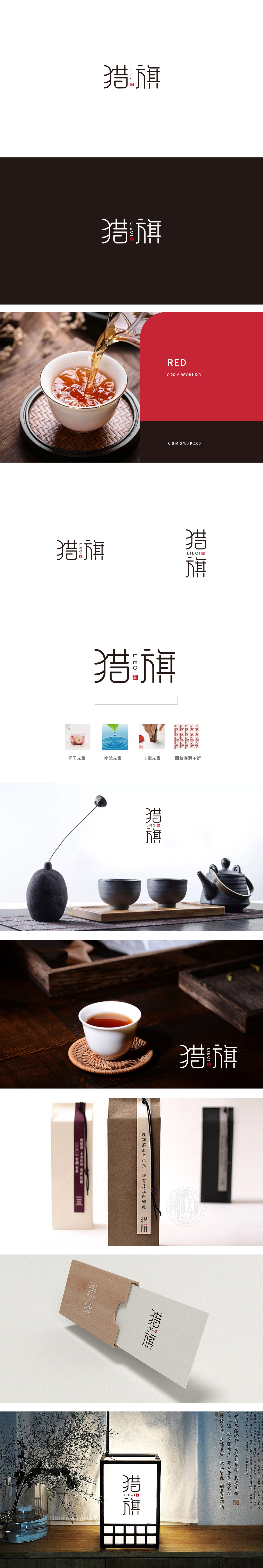
狮动设计采用直线与曲线结合,“猎”字的“犭”旁以舒展的线条模拟旗帜飘扬或狩猎的动态感,同时融入茶杯形状,行业属性辨识度高。“昔”字结构沉稳;“旗”字则通过竖笔的延伸和左右对称的布局,强化“旗帜”的意象,整体传递出品牌的鲜明定位与引领感。红色“茶”字印章作为视觉焦点,既点明品类属性,又融入传统篆刻文化,形成“现代字体+传统印章”的碰撞,既有记忆点又不失文化底蕴。从直观的产品元素到抽象的文化寓意,层层递进地传递“品质、传统、传承、发展”的品牌内核。
Lion design adopts a combination of straight lines and curves, and the stretched lines beside the word "hunting" simulate the dynamic feeling of flag flying or hunting, and at the same time, it is integrated into the shape of a teacup, which has high recognition of industry attributes. The word "past" has a steady structure; The word "flag" strengthens the image of "flag" through the extension of vertical pen and the symmetrical layout, and conveys the distinct positioning and leading sense of the brand as a whole.


扫码或拨打添加客服微信


