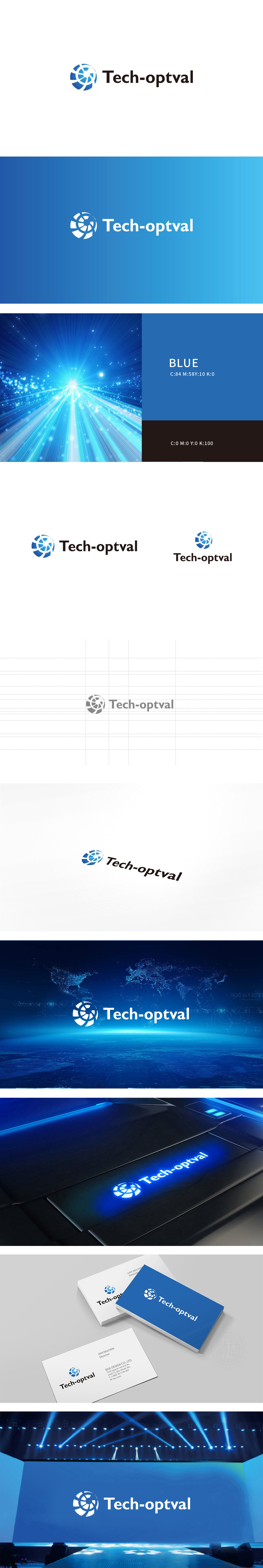
狮动设计以蓝色为主色调,通过几何线条的对称分布与渐变层次,构建出类似“齿轮”或“光学棱镜”的意象,既传递了科技行业的精密感与专业性,又巧妙呼应了“opt”(可能关联“光学”“优化”)的含义,整体简洁且富有现代科技气息。文字部分采用黑体与斜体结合的字体,“Tech”与“optval”的衔接自然,既突出了技术属性,又让品牌名称易于识别和记忆。
Lion design takes blue as the main color, and through the symmetrical distribution and gradual gradation of geometric lines, it constructs an image similar to "gear" or "optical prism", which not only conveys the precision and professionalism of the technology industry, but also skillfully echoes the meaning of "opt" (which may be related to "optics" and "optimization"), and is simple and full of modern science and technology. The text part adopts a combination of bold and italic fonts, and the connection between "Tech" and "optval" is natural.


扫码或拨打添加客服微信


