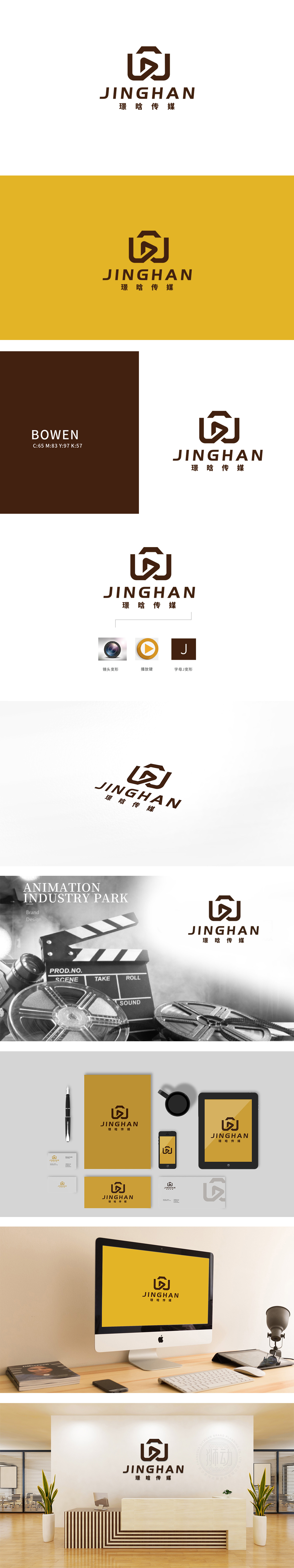
狮动设计由两个对称的“J”形线条(或“U”形变体)交叉融合,形成一个类似“镜头”或“取景框”的轮廓,直接关联传媒、影视行业的“影像记录”核心功能,同时外框的闭合感象征“专业边界”与“内容聚焦”。中心嵌入一个三角形播放按钮(▶),这是多媒体、视频领域的经典符号,明确传递“影视、传播、动态内容”的行业属性。播放键与外框的嵌套关系,隐喻“通过专业平台(外框)传递优质内容(播放键)”的品牌定位。棕褐色线条粗壮有力,传递稳重、可靠的品牌气质;无渐变、无装饰的纯色设计,体现简约、高效的现代感,避免视觉干扰,强化记忆点。通过“镜头+播放键”的符号化组合,直观传递了传媒影视行业属性,同时以棕褐色调与对称结构塑造了“专业、稳重、可靠”的品牌形象。
Lion Design is composed of two symmetrical J-shaped lines (or U-shaped deformable bodies) which cross and merge to form an outline similar to "lens" or "view frame", which is directly related to the core function of "image recording" in media and film industry, and the closure of the outer frame symbolizes "professional boundary" and "content focus". A triangle play button () is embedded in the center, which is a classic symbol in the field of multimedia and video, and clearly conveys the industry attributes of "film, television, communication and dynamic content". The nested relationship between the play key and the outer frame is a metaphor for the brand positioning of "delivering high-quality content (play key) through a professional platform (outer frame)". Brown lines are thick and powerful, conveying a stable and reliable brand temperament;


扫码或拨打添加客服微信


