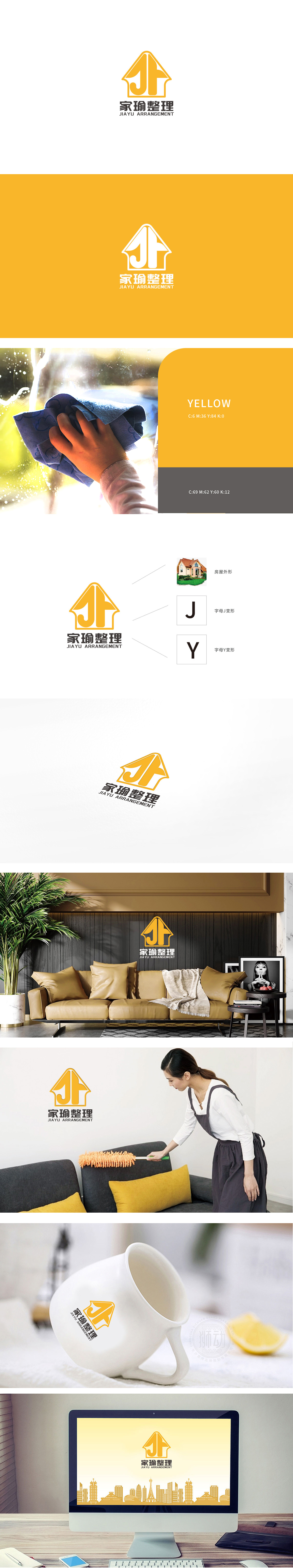
狮动设计以黄色三角形屋顶为基础,线条圆润柔和,既保留了“家”的具象认知,又通过钝角处理避免尖锐感,传递温暖、安全的空间属性,契合“整理”服务对“家”的场景聚焦。“J”:以流畅的曲线构成,形似整理时“收纳”的动态感,“Y”:以挺拔的折线为主,象征“整理”后的“秩序”与“条理”,寓意空间通过整理实现“升级”。 黄色在视觉心理学中代表活力、温暖、明亮,既呼应“整理”服务带来的“焕然一新”,通过低饱和度的暖黄色调避免刺激感,传递专业、亲切的品牌性格,符合家庭服务场景的亲和力需求,构建出“专业、亲切、高效”的品牌形象。
Lion design is based on the yellow triangular roof, and the lines are round and soft, which not only retains the concrete cognition of "home", but also avoids the sharp feeling through obtuse angle treatment, and conveys the warm and safe space attribute, which is in line with the focus of "home" scene by "finishing" service. "J" is composed of smooth curves, which is similar to the dynamic sense of "storage" when finishing, and "Y" is dominated by straight and straight broken lines, which symbolizes "order" and "order" after finishing, and implies that the space is "upgraded" through finishing. In visual psychology, yellow represents vitality, warmth and brightness.


扫码或拨打添加客服微信


