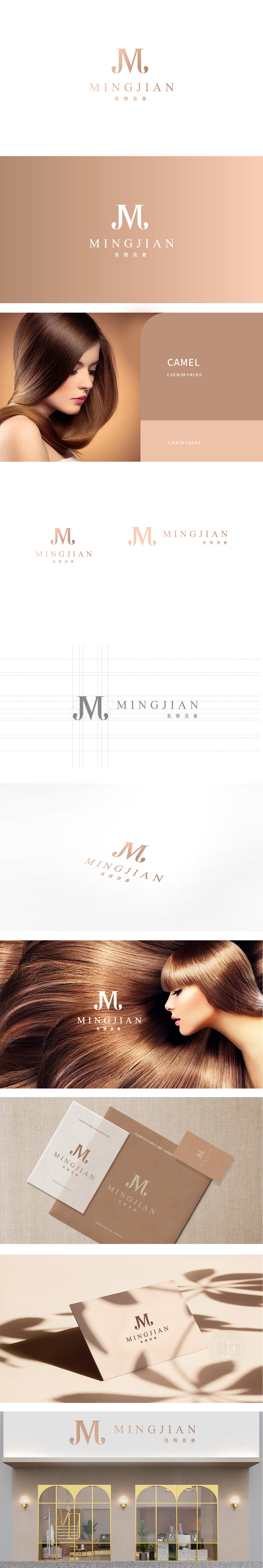
狮动设计以“J”和“M”两个字母为主体,采用流畅的曲线与锐利的折线结合。交叉”的动态感,暗合剪发时“精准剪裁”与“柔和造型”的双重特质。“M”的中间竖线略微倾斜,打破对称感,仿佛剪刀在发丝间滑动的瞬间,赋予静态图形以“剪发时的动态张力”。字母间距疏朗,笔画简洁利落,没有多余装饰,呼应剪发行业“精准、高效、专业”的核心诉求——如同发型师用剪刀“去繁就简”,打造利落造型。通过字母形态的隐喻、线条的动态感、色彩的层次暗示,将“剪发”的专业性、艺术性与动态过程融入抽象图形中。玫瑰金的优雅与线条的利落结合,精准传递了“名剪美业”作为高端剪发品牌的定位。
Lion design takes the letters "J" and "M" as the main body, and combines smooth curves with sharp broken lines. The dynamic sense of crossing coincides with the dual characteristics of "precise cutting" and "soft modeling" when cutting hair. The vertical line in the middle of the "M" is slightly inclined, which breaks the sense of symmetry, just like the moment when scissors slide between hair, giving static graphics "dynamic tension when cutting hair". The letter spacing is sparse, the strokes are concise and neat, and there is no unnecessary decoration, echoing the core appeal of "accuracy, efficiency and professionalism" in the hair cutting industry-just like a hairdresser uses scissors to "simplify the complex" and create a neat shape.


扫码或拨打添加客服微信


