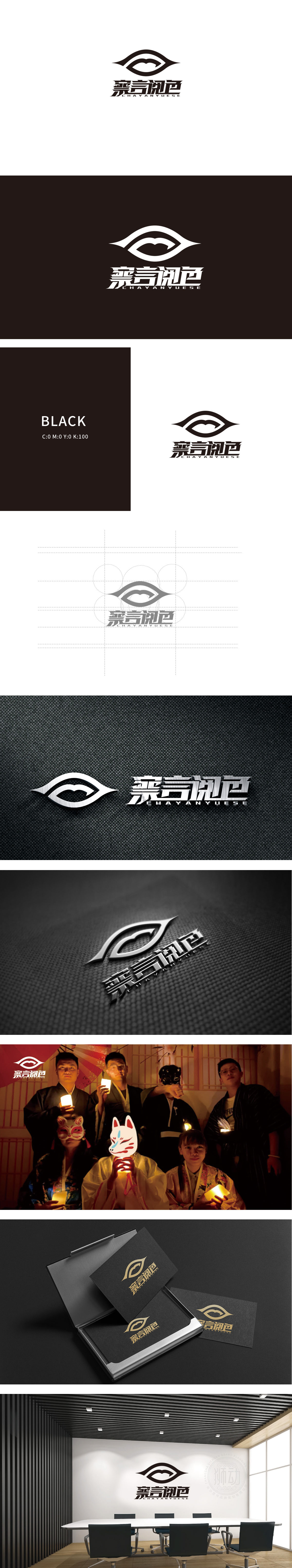
狮动设计采用眼睛”与“观察”的隐喻,上半部分的流畅曲线勾勒出抽象的“眼睛轮廓”,眼尾微微上扬,既有凝视的专注感,又暗藏一丝神秘感,仿佛玩家在游戏中通过“眼睛”洞察真相。眼球部分被巧妙设计为“山峦/波浪”形态的曲线,既像层叠的迷雾,又似人物内心的波澜,引导视线聚焦,强化“注视”与“探寻”的动作感。“察言阅色”字体设计:采用锋利的书法笔触,“察”“阅”二字的笔画如刀刻般锐利,“言”“色”则通过断笔、连笔营造动态感,整体既有中式悬疑的厚重感,又不失现代桌游的年轻活力,让视觉成为游戏体验的“前序铺垫”,用符号点燃玩家的探索欲。
Lion design adopts the metaphor of "eyes" and "observation". The smooth curve in the upper part outlines the abstract "eye outline", and the tail of the eye rises slightly, which not only has a sense of concentration in staring, but also hides a little mystery, as if the player can see the truth through "eyes" in the game. The eyeball part is cleverly designed as a curve in the shape of "mountains/waves", which is like a layered fog and a wave in the character's heart, guiding the line of sight to focus and strengthening the sense of action of "watching" and "exploring". Font design of "observing words and reading colors".


扫码或拨打添加客服微信


