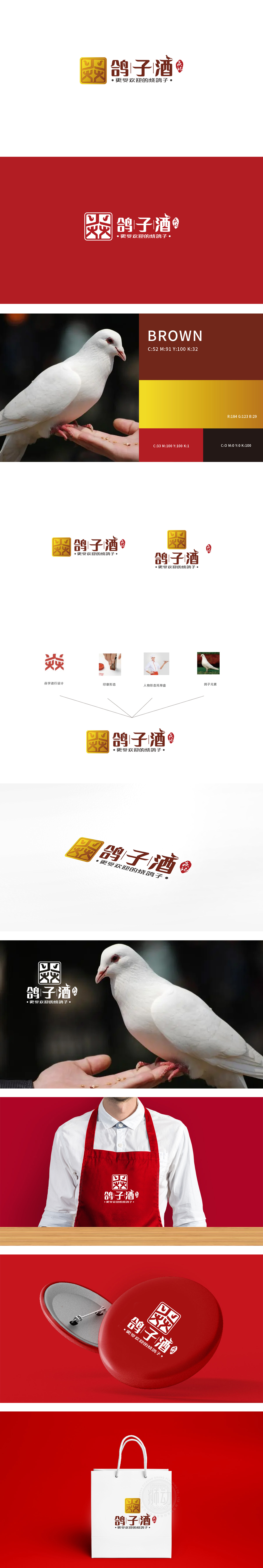
狮动设计将金色方形印章作为设计的核心亮点,采用传统篆刻艺术风格,内部通过抽象线条构成类似“鸽”字的变形符号,既保留了印章的权威感与文化厚重感,又通过对称结构和流畅曲线传递出平衡与精致。“鸽”“子”“酒”三字:笔画厚重饱满,起笔收笔带有毛笔书法的顿挫感,如“鸽”字的右半部分、“酒”字的三点水,通过书法笔触传递“手工制作”“匠心风味”的品牌调性。通过“印章(权威)+书法(匠心)+传统色彩(经典)”的组合,精准定位“烧鸽子”这一细分品类的差异化——不强调“快餐便捷”,而是突出“文化传承”“品质认可”“地域特色”。
Lion design takes the golden square seal as the core highlight of the design, adopts the traditional seal cutting style, and forms a deformation symbol similar to the word "pigeon" through abstract lines inside, which not only retains the authority and cultural weight of the seal, but also conveys balance and exquisiteness through the symmetrical structure and smooth curves. "Pigeon", "Zi" and "Wine" are three characters: the strokes are thick and full, with a sense of frustration in brush calligraphy, such as the right half of the word "pigeon" and three drops of water in the word "wine", which convey the brand tonality of "handmade" and "ingenious flavor" through calligraphy strokes.


扫码或拨打添加客服微信


