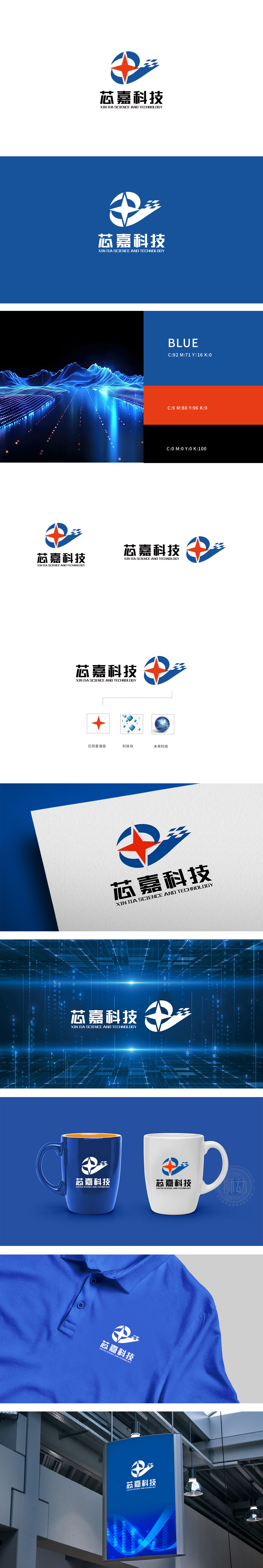
狮动设计以红色五角星位于标志中心,棱角分明、指向性强,采用对称放射状设计,象征科技的突破力与引领性。红色传递活力、创新与激情,同时增强视觉冲击力,在蓝色为主的背景中形成鲜明对比,突出品牌核心价值。环绕五角星的蓝色半环,形似科技感的“能量场”或“数据循环”,隐喻企业的包容性与技术闭环能力,同时强化标志的整体凝聚力。通过“中心五角星(核心技术)+ 环形(生态闭环)+ 飘带(发展速度)”的组合,直观传递“以核心技术为驱动,构建开放生态,引领行业发展”的品牌定位。
Lion design is located in the center of the logo with a red five-pointed star, which is angular and directional, and adopts a symmetrical radial design, symbolizing the breakthrough and leading role of science and technology. Red conveys vitality, innovation and passion, at the same time, it enhances the visual impact, forms a sharp contrast in the background dominated by blue, and highlights the core value of the brand. The blue half-ring around the five-pointed star looks like the "energy field" or "data cycle" of science and technology, which symbolizes the inclusiveness of enterprises and the closed-loop ability of technology, and at the same time strengthens the overall cohesion of the logo.


扫码或拨打添加客服微信


