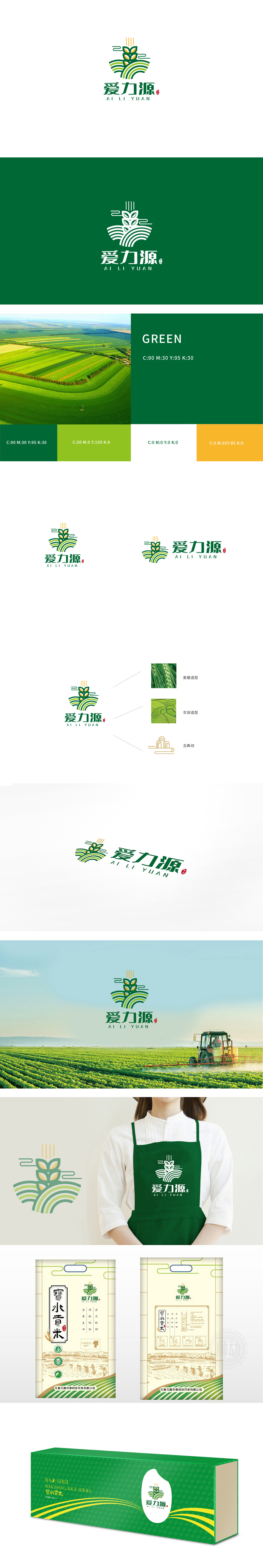
狮动设计采用以“稻穗/麦穗”为视觉锚点,直接关联粮食属性。绿色叶片象征作物的自然生长状态,符合农产品“原生态”的核心价值;黄色颗粒明确对应“稻米”,是产品属性的直观视觉符号,让消费者能快速联想到“粮食”“健康”等关键词。 波浪线条:隐喻“土地”与“水源”,强化农业意象。绿色渐变(从深到浅)既增强了图形的层次感和动感,也隐喻了“生态、健康、可持续”的品牌理念。整体通过“稻穗颗粒+波浪土地+向上线条”三个核心符号,层层递进地传递了“农产品—生态种植—活力源泉”“健康粮”的整体定位。
Lion design takes "ear of rice/ear of wheat" as the visual anchor point, which is directly related to grain attributes.Green leaves symbolize the natural growth state of crops and conform to the core value of "original ecology" of agricultural products; Yellow particles clearly correspond to "rice", which is an intuitive visual symbol of product attributes, allowing consumers to quickly associate with keywords such as "food" and "health". Wave lines: Metaphor "land" and "water source", strengthen agricultural image. The gradual change of green (from deep to shallow) not only enhances the layering and movement of graphics.


扫码或拨打添加客服微信


