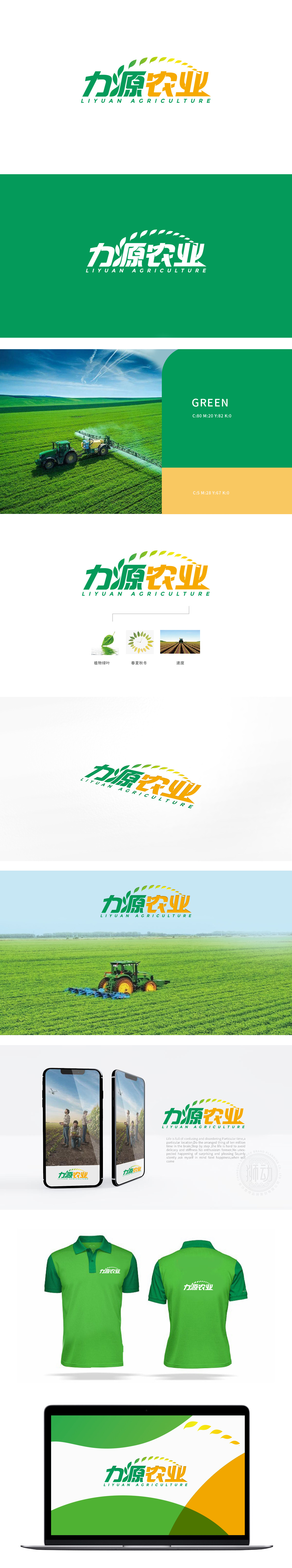
狮动设计将品牌名称视觉化设计,“力源”,“力”字笔画刚劲,“源”字顶部融入向上生长的叶片形态,既呼应“源”的本义(源头、根源),又以植物意象暗喻农业的生命力,将文字与图形符号无缝结合,增强记忆点。从深绿到浅黄的渐变色叶片呈弧形排列,形似向上攀升的轨迹或阳光照射的方向,既象征农业生产中“光合作用→生长周期”的自然规律,整体以自然为源、以科技为力,通过清晰的视觉逻辑和符号体系,成功塑造了“有活力、重品质、高效率”的品牌形象。
Lion Design visually designs the brand name, and the strokes of "Liyuan" and "Liyuan" are strong, and the top of the word "Yuanyuan" is integrated into the upward-growing leaf shape, which not only echoes the original meaning (source and root) of "Yuanyuan", but also implies the vitality of agriculture with plant images, and seamlessly combines words and graphic symbols to enhance memory points. The gradually changing leaves from dark green to light yellow are arranged in an arc, which looks like an upward trajectory or the direction of sunlight.


扫码或拨打添加客服微信


