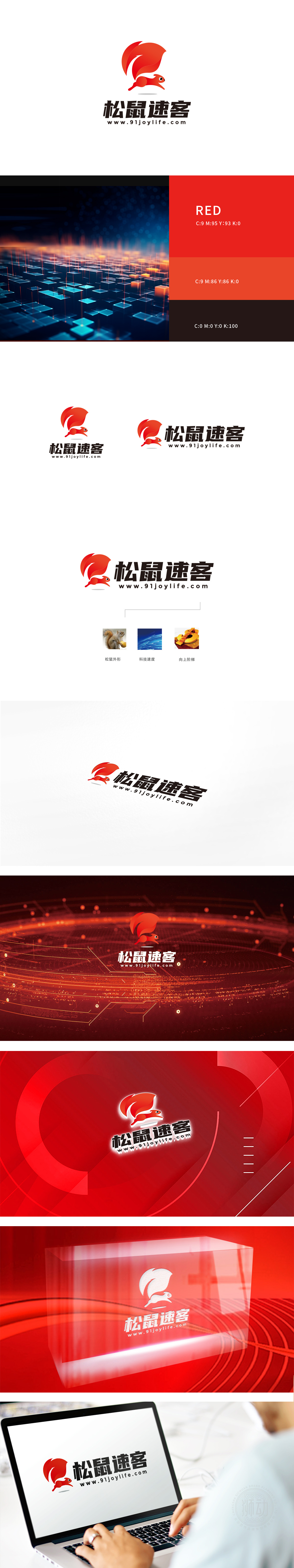
狮动设计以流线型造型:松鼠的身体和尾部采用夸张的弧形线条,形成向前“冲刺”的动态姿态,尾部的飘逸感强化了“速度”和“敏捷”的印象——这与互联网服务追求的“高效、即时、灵活”不谋而合。红色在视觉上极具冲击力,传递出活力、热情与紧迫感,符合“速客”中“速度”的品牌定位,用极简的色块和线条勾勒,符合互联网品牌“易识别、易传播 快速整合信息/服务/商品”的平台”的特性,像“松鼠”样,为用户高效“储备”和“匹配”所需资源。
Lion design is streamlined: the squirrel's body and tail adopt exaggerated arc lines to form a dynamic posture of "sprinting forward", and the elegant feeling of the tail strengthens the impression of "speed" and "agility", which coincides with the "high efficiency, immediacy and flexibility" pursued by Internet services. Red has great visual impact, conveys vitality, enthusiasm and urgency, conforms to the brand positioning of "speed" in "Express Guest", is outlined with minimalist color blocks and lines, and conforms to the characteristics of Internet brand "platform for quickly integrating .


扫码或拨打添加客服微信


