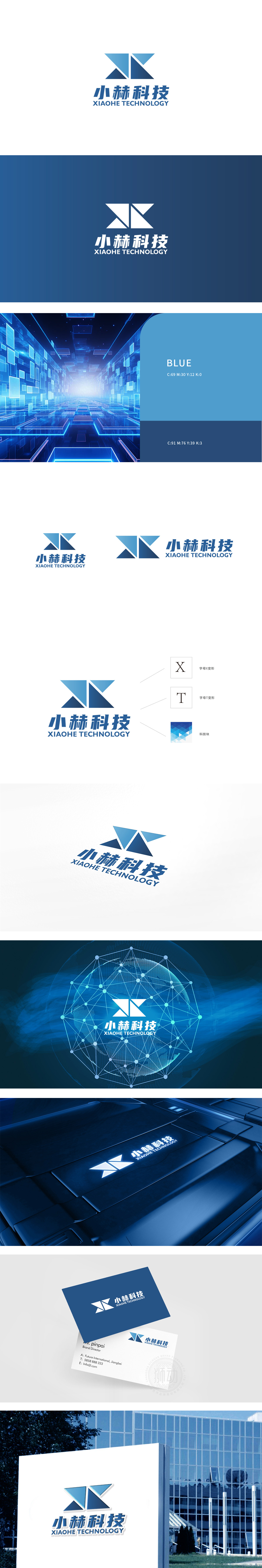
狮动设计采用两组蓝色渐变三角形交叉构成,形成类似“X”的抽象符号,同时暗藏“赫”字首字母“H”的结构联想,设计逻辑清晰且富有层次:三角形是稳定性与科技感的经典视觉载体,锐角设计传递进取、突破的动态感,符合科技企业的创新属性。上下两组三角形交叉形成对称平衡,又通过蓝白分割,增强空间感,体现“科技连接”的隐喻。整体以几何图形为核心,通过对称结构、渐变色彩与简洁文字的组合,成功塑造了“专业、创新、可靠”的科技品牌形象。
Lion design is composed of two groups of blue gradient triangles, forming an abstract symbol similar to "X", and at the same time hiding the structural association of the initial letter "H". The design logic is clear and hierarchical: the triangle is the classic visual carrier of stability and sense of science and technology, and the acute angle design conveys the dynamic sense of enterprising and breakthrough, which conforms to the innovative attributes of science and technology enterprises. The upper and lower groups of triangles cross to form a symmetrical balance, and through the blue-white division, the sense of space is enhanced, reflecting the metaphor of "scientific and technological connection".


扫码或拨打添加客服微信


