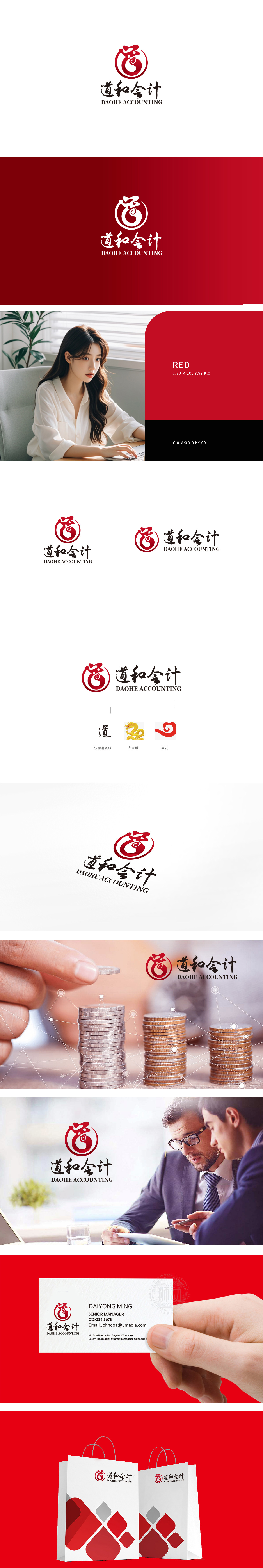
狮动设计以红色圆形为基底,嵌套变形,“道”的抽象化:暗合会计行业“精打细算”的职业特性;“和”的流动感:象征会计工作中“资金流转”“账目闭环”的专业逻辑;采用“书法笔触”的线条质感,笔锋转折处兼具力量感与韵律感,传递出“道和会计”兼具专业严谨与人文温度的品牌调性。整体将品牌理念、行业特性与文化符号进行了三位一体的融合:让“无形的品牌理念”通过“有形的视觉符号”传递;塑造了一个“有文化底蕴、有专业温度、有记忆点”的会计品牌形象。
Lion design is based on red circle, nested and deformed, and the abstraction of "Tao" coincides with the professional characteristics of "careful calculation" in accounting industry; The sense of mobility of "harmony" symbolizes the professional logic of "capital flow" and "closed loop of accounts" in accounting work; Using the line texture of "calligraphy brushwork", the turning point of brushwork has both a sense of strength and rhythm, conveying the brand tonality of "Tao and accounting" with both professional rigor and humanistic temperature. As a whole, the brand concept, industry characteristics and cultural symbols are integrated in a trinity: "invisible brand concept" is transmitted through "tangible visual symbols".


扫码或拨打添加客服微信


