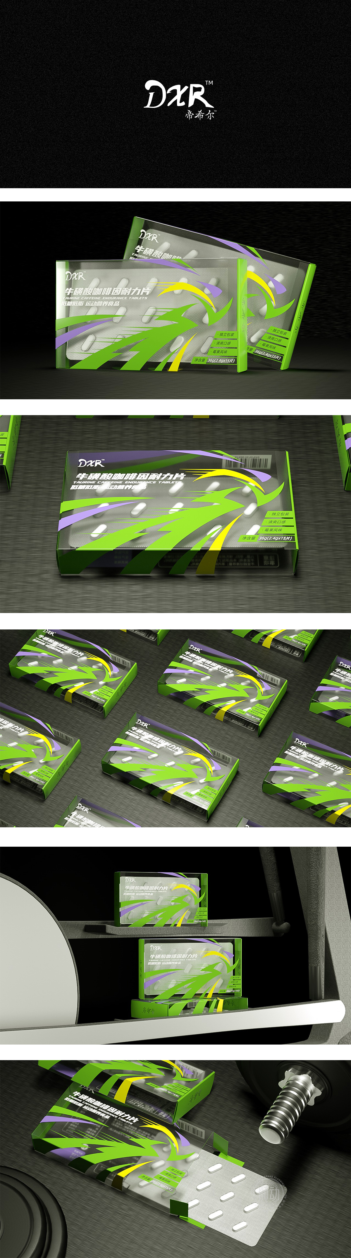
狮动设计采用荧光绿+亮黄+深紫的撞色搭配,绿色象征能量与持续力,黄色线条模拟速度轨迹,紫色则增添科技感与高端属性,流线型图形语言——传递“动态”与“效率”,绿色主图形以放射状线条+箭头形态为主视觉,配合黄色、紫色的辅助线条,形成强烈的“速度感”和“向前冲”的视觉动势,直观呼应“耐力片”提升运动表现的核心功能。整体通过动态视觉符号、精准信息分层、场景化色彩,成功将“耐力提升”的功能卖点转化为可感知的视觉语言,建立“专业、高效、便捷”的品牌认知。
Lion design adopts the contrast color of fluorescent green+bright yellow+deep purple, green symbolizes energy and persistence, yellow lines simulate the speed trajectory, purple adds a sense of science and technology and high-end attributes, streamlined graphic language conveys "dynamics" and "efficiency", and the green main graphic takes the form of radial lines+arrows as the main vision, with yellow and purple auxiliary lines, forming a strong sense of speed and rushing forward. Through dynamic visual symbols, accurate information layering and scene color, the functional selling point of "endurance improvement" has been successfully transformed into perceptible visual language.


扫码或拨打添加客服微信


