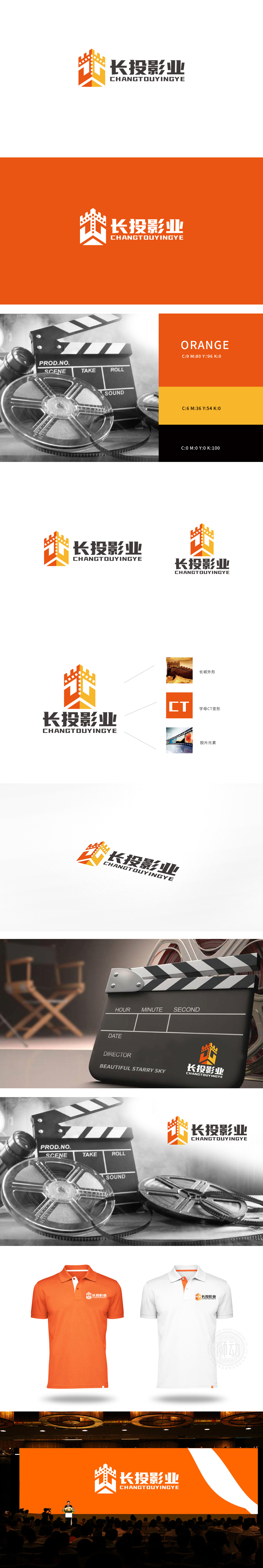
狮动设计以 电影胶片 为核心视觉符号,通过橙、黄渐变的立体切割造型,将胶片的“齿孔”结构抽象为向上延伸的几何形态,既保留了影视行业的辨识度(胶片是电影的经典载体),又通过棱角分明的线条传递出力量感与专业性。胶片片段的“堆叠”设计形成视觉层次,暗喻内容创作的积累与影视项目的多元整合,同时“向上”的趋势象征品牌的成长性与行业愿景。整体既有胶片、光影等影视行业的经典符号,又通过几何化、色彩渐变等现代设计语言打破传统影视LOGO的刻板印象,传递“长投影业”作为“内容投资者+产业整合者”的双重身份——既懂影视创作规律(创意属性),又具备专业投资视野(稳健属性)。
Lion design takes the film as the core visual symbol, and abstracts the "tooth hole" structure of the film into an upward extending geometric shape through the three-dimensional cutting modeling of orange and yellow gradient, which not only retains the recognition of the film industry (film is the classic carrier of the film), but also conveys the sense of output and professionalism through angular lines. The "stacking" design of film clips forms a visual level, which is a metaphor for the accumulation of content creation and the multi-integration of film and television projects, while the "upward" trend symbolizes the growth of brands and industry vision.


扫码或拨打添加客服微信


