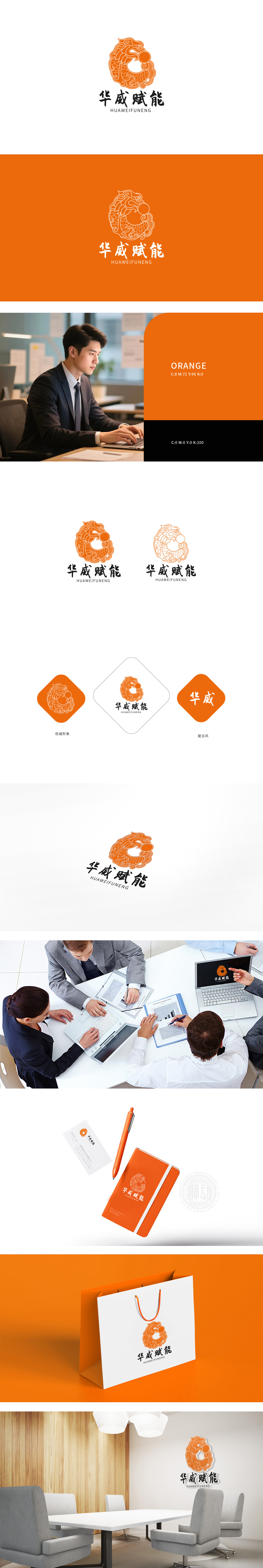
狮动设计以神兽形象,尽显威严气势;而身体部分则化为鱼形,鳞片以流畅的波浪纹勾勒,尾部卷曲成环形,与头部形成“首尾相接”的循环结构,整体造型既刚劲有力又不失灵动韵律。采用单一的橙色系,既保留了中国传统纹样中暖色调的厚重感,又通过明度差异塑造出立体层次;线条以“铁线描”为主,刚直与曲弧交替——龙首的棱角、鱼鳍的锐边展现力量感,而鳞片的弧度、尾部的涡旋则体现流畅性,传统纹样的“程式化”与现代设计的“简约感”在此融合。通过“形态融合”(龙首+鱼身)、“结构重构”(闭环循环)、“意义叠加”(权威+蜕变+循环),将传统纹样从“装饰性”升华为“叙事性”,既唤醒了大众对本土文化的情感共鸣,又以现代设计语言传递出品牌的核心价值。
Lion design uses the image of a beast to show its majestic momentum; The body part is fish-shaped, the scales are outlined with smooth wavy lines, and the tail is curled into a ring, forming a "head-to-head" circular structure with the head. The overall shape is both strong and dynamic. Adopting a single orange color system not only retains the heavy feeling of warm colors in China traditional patterns, but also creates a three-dimensional level through the difference in lightness; The lines are dominated by "iron line drawing", with rigidity alternating with curved arcs-the edges and corners of the dragon head and the sharp edges of the fins show a sense of strength.


扫码或拨打添加客服微信


