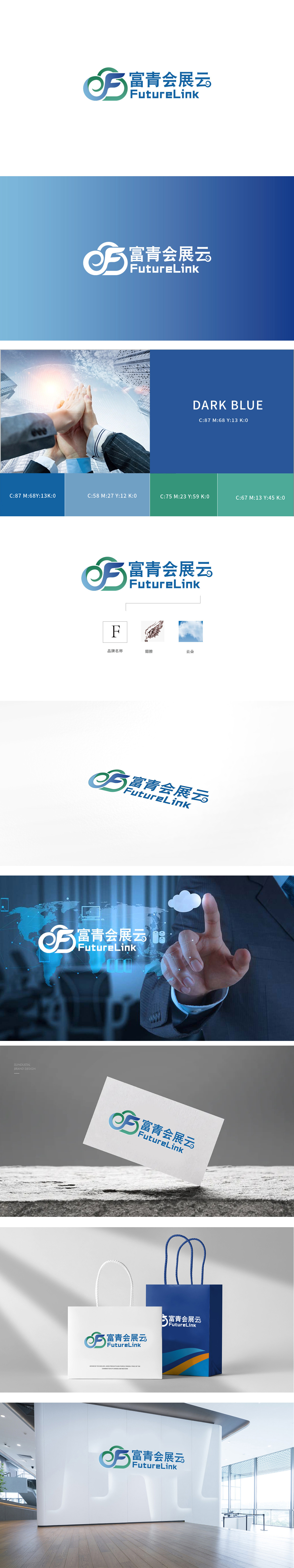
狮动设计以品牌名称“富青”拼音首字母“F”为视觉核心,通过蓝、绿两色线条的缠绕与穿插,将抽象字母转化为动态的视觉符号。蓝色线条构成“F”的主体轮廓,绿色线条则以环绕、延伸的方式与之呼应,形成“包裹中带有延伸”的结构,既突出品牌识别性,又传递“连接、包容”的概念。“云”的意象化表达:贴合“会展云”的“云服务”属性(象征云端平台、数据存储与共享),又通过曲线的流动性传递“灵活、高效、无边界”的行业特点。整体通过流畅的图形符号与清晰的文字组合,直观传递“会展云平台”的核心定位。色彩搭配沉稳且富有活力,图形结构巧妙融合了品牌首字母、行业特征与科技理念,展现出专业且前瞻的设计思路。
Lion Design takes the initial letter "F" of the brand name "Fuqing" as the visual core, and transforms abstract letters into dynamic visual symbols through the winding and interweaving of blue and green lines. Blue lines constitute the main outline of "F", and green lines echo it in a way of encircling and extending, forming a structure of "extension in the package", which not only highlights the brand recognition, but also conveys the concept of "connection and tolerance". Imagery expression of "cloud": it fits the "cloud service" attribute of "exhibition cloud" (symbolizing cloud platform, data storage and sharing), and conveys the industry characteristics of "flexibility, efficiency and boundlessness" through the fluidity of curve.


扫码或拨打添加客服微信


