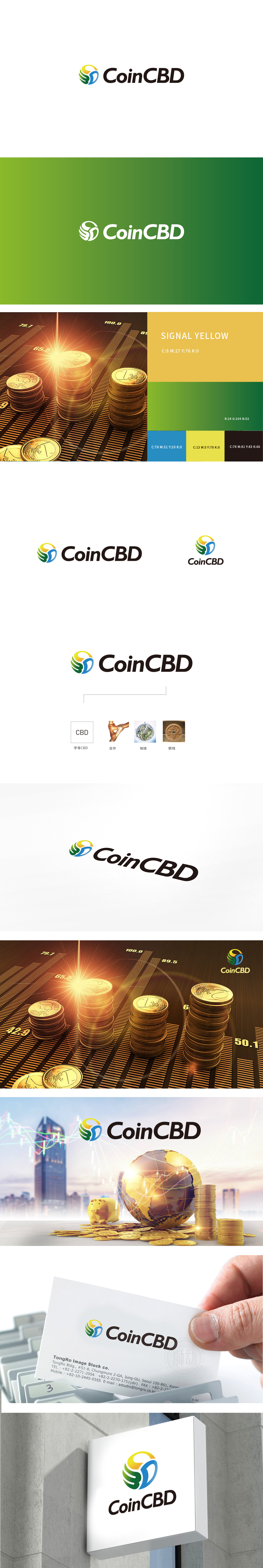
狮动设计以多色渐变的“环形+叶片/羽翼状元素”构成,核心传递了两层金融相关的设计逻辑:环形在金融视觉中常象征“闭环生态”“流动性”或“持续增长”,强化了与“价值载体”的关联。叶片/羽翼的动态感,既传递“增长”“突破”的积极意象,又通过线条的流动感暗示“灵活性”“动态平衡”。设计通过“抽象图形隐喻价值流动+行业色彩传递专业属性+简洁文字强化品牌识别”,成功构建了数字化”“科技驱动”属性,体现了对“多元化金融生态”的品牌定位支撑。
Lion design is composed of multi-color gradient "ring+blade/wing element", and its core conveys two levels of financial related design logic: ring often symbolizes "closed-loop ecology", "liquidity" or "sustainable growth" in financial vision, which strengthens the connection with "value carrier". The dynamic sense of blades/wings not only conveys the positive image of "growth" and "breakthrough", but also implies "flexibility" and "dynamic balance" through the flowing sense of lines. Through "abstract graphic metaphor value flow+industry color transmission professional attribute+concise words to strengthen brand recognition".


扫码或拨打添加客服微信


