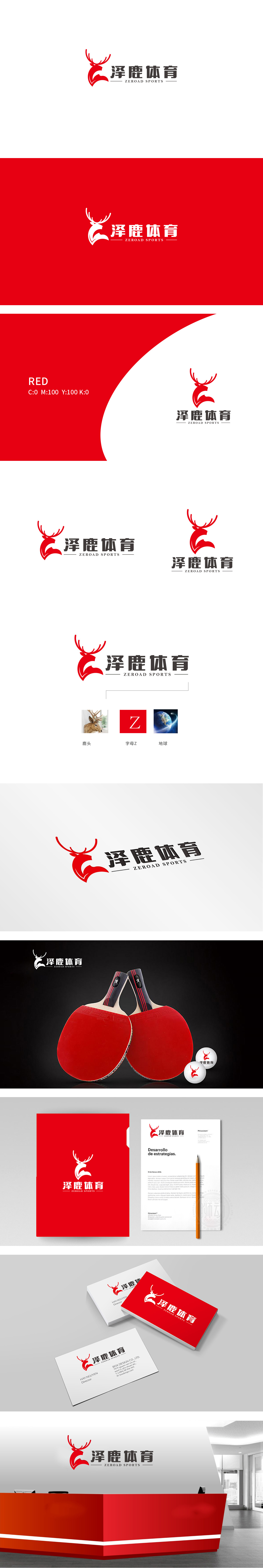
狮动设计以抽象化的鹿角为主体,向上延伸的分叉线条呈现出放射状张力,类似乒乓球击球瞬间的爆发力与轨迹的动态感。鹿角的尖锐轮廓与乒乓球运动中“快速、精准”的特性形成视觉呼应,而弯曲的线条又暗含球的旋转轨迹。整体形态的平衡感:既像运动员挥拍时的肢体舒展,也暗合乒乓球运动中“攻防转换”的平衡理念——力量与灵活性的结合,红色作为主色调,传递出体育品牌的激情、能量与竞技精神,与乒乓球运动中快节奏、高强度的对抗氛围高度匹配,传递“从零开始,助力运动之路”的品牌理念。
Lion design takes the abstract antlers as the main body, and the branched lines extending upward show radial tension, which is similar to the explosive force of table tennis at the moment of hitting the ball and the dynamic sense of the trajectory. The sharp outline of antlers visually echoes the characteristics of "quickness and accuracy" in table tennis, while the curved lines imply the rotation track of the ball. The sense of balance in the overall form: it is not only like the physical stretching of athletes when swinging, but also coincides with the balance concept of "attack and defense conversion" in table tennis-the combination of strength and flexibility.


扫码或拨打添加客服微信


