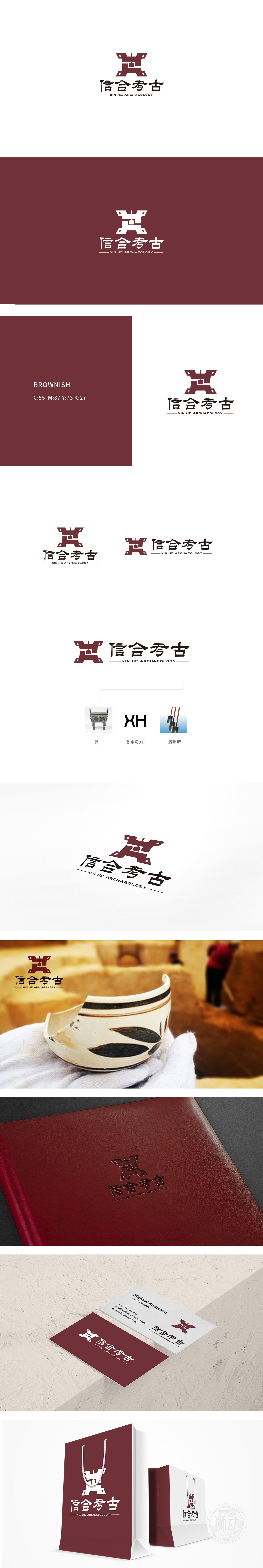
狮动设计以“信合”作为品牌名,“信”代表诚信、公信力,“合”代表合作、融合(考古工作需多学科协作,也需与历史文化融合)。标志通过“合”字的图形化演绎,将“合作”具象为结构上的“聚合”——探方的框架象征“规范”,铃铛象征“文化内核”,二者的结合暗合“以规范之法,聚合文化之魂”的品牌理念。颜色选用深棕色/赭石色,沉稳且贴近土地、文物的色调,强化了考古行业与“历史”“大地”的关联性,视觉上传递出厚重、可靠的专业气质。
Lion Design takes "Xinhe" as its brand name, "Xin" stands for honesty and credibility, and "He" stands for cooperation and integration (archaeological work needs multidisciplinary cooperation and integration with history and culture). Through the graphic interpretation of the word "He", the logo represents "cooperation" as a structural "aggregation"-the framework of the exploration side symbolizes "standardization" and the bell symbolizes "cultural core". The combination of the two coincides with the brand concept of "aggregating the soul of culture with the method of standardization".


扫码或拨打添加客服微信


