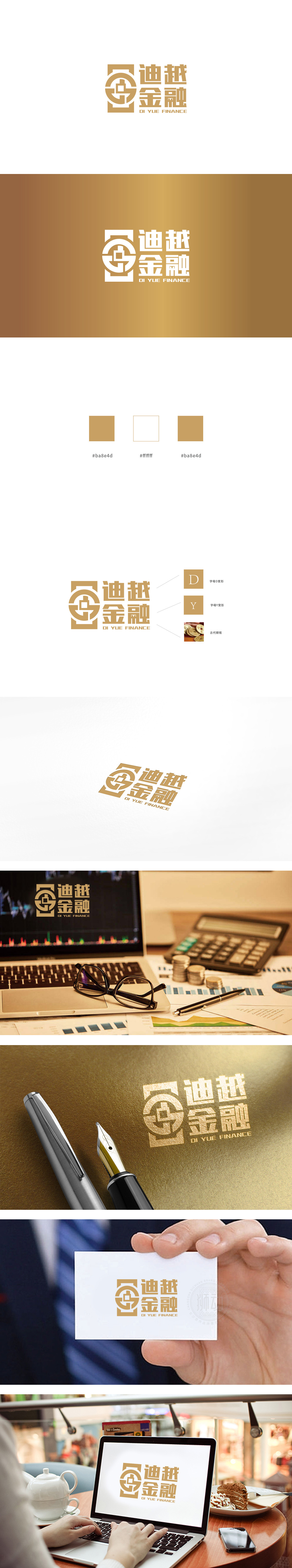
狮动设计以 “方”与“圆” 为基础框架,外层为方形轮廓(象征规范、信任、边界感,契合金融行业的稳健属性),内部嵌套圆形与抽象化“古钱币”纹样(圆形代表流通、包容,钱币元素直接关联金融行业的核心——价值与财富)。既强化了“方”的稳定感,又通过线条的穿插形成视觉焦点,整体通过 “符号隐喻+结构化字体+行业色彩” 的三重组合,成功构建了“传统底蕴+现代金融”的品牌形象:实现了“专业可信”与“文化温度”的双重表达。
Lion design is based on "square" and "circle", with a square outline on the outer layer (symbolizing norms, trust and sense of boundary, which is in line with the stable attributes of the financial industry), and an embedded circle and an abstract "ancient coin" pattern (circle represents circulation and tolerance, and coin elements are directly related to the core of the financial industry-value and wealth). It not only strengthens the sense of stability of the square, but also forms the visual focus through the interpenetration of lines.


扫码或拨打添加客服微信


